Ho-hum.
That seems to be the response from desktop users and reviewers of Ubuntu’s latest and greatest, 15.04 or Vivid Vervet. The server and cloud crowd are all abuzz, tearing this baby down to see what it can do. But for the desktop folks — not so much. About all you read is that the new desktop is mainly cosmetic changes: that Unity’s color scheme is now purple, which isn’t quite true — to my eyes, there’s some orange in there too — and that a few things have been moved back to where they used to be. Other than that, everyone complains that this vervet is nothing more than lipstick on a unicorn, as Utopic Unicorn was Ubuntu’s last release.

A couple of days ago, I downloaded the newborn Ubuntu primate to evaluate all the fuss. I figured that since I have no practical experience with Ubuntu, I’d bring no expectations and fresh eyes to the release. I did the installation on our Symple PC, which came preinstalled with Ubuntu 14.04, my only other experience with the distro-that-Shuttleworth-built, and has a 2.8 GHz dual core processor and 2 GB RAM. Since many home users install Linux on old metal, I figured these specs would be perfect for seeing how the operating system handles under real world situations.
I installed after booting to a “live DVD,” which was actually an image on a USB drive I created with Unetbootin’. I created a 20 GB partition for the test installation, which was as easy as pi (and much easier than Raspberry Pi), as was the entire installation process. After a few clicks, I was ready to reboot to see how Ubuntu 15.04 would handle running natively from the hard drive.
Unity
First up, of course, was Unity, the Ubuntu desktop environment. According to who’s talking, Unity is either Ubuntu’s biggest boondoggle or it’s greatest strength. In my FOSS folk filled circles, people generally despise it with a passion and think it to be the worst thing to happen to open source since GNOME 3. Only systemd elicits more passion.
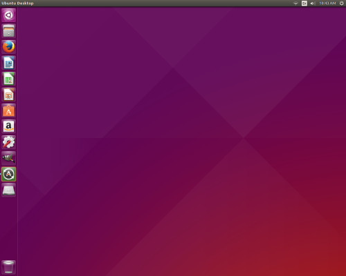
Quite frankly, I don’t understand all the brouhaha. For new-to-Linux users, fresh from the world of Windows, Macintosh or even Android, it’s an easy to learn and use interface. While it’s certainly not my mug of coffee (despite my British ancestry, I don’t do tea), I don’t find myself cursing out loud or anything while using it, as I do sometimes with Windows.
However, there is much about Unity to not like. For starters, as Windows users like to say: Where’s the damn “Start” button? Or the big “K” or any other sane and simple way to get to a menu.
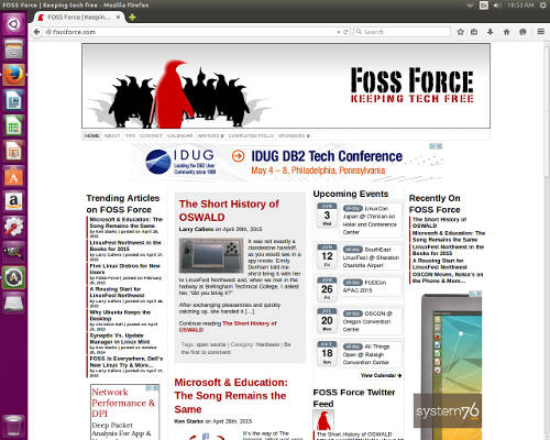
Then there’s the launch bar (or whatever Ubuntu calls it) running down the left side of the screen, taking up way to much screen real estate. I understand that it gives Ubuntu easily recognizable branding, but it plays hell with how web sites display on the screen, especially when using an old square monitor, which I was for this review.
Dashboard
Dashboard, which should be called “Billboard,” is Unity’s idea of a menu replacement and more. It’s accessed through a little round icon at the top of the launch bar, which looks a bit like a stylized version of the Ubuntu logo and a bit like one of those gee whiz round locks that are often seen on elevator panels. It’s used to look for installed programs in Unity, since there’s no handy and easy-to-reach menu available. It’s also the “find” function for…well, finding stuff.
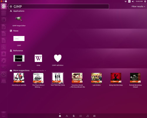
Clicking on it brings up an interface which pretty much looks like the Google Play Store on Android — except in this case it might be more appropriately called the Amazon Play Store. Type in the name of an application that’s already installed and it’ll serve up a link to that app — while trying to sell you tons of stuff, presumably from Amazon. If it’s an app not installed, it’ll give you some suggestions, then try to sell you more stuff — again, presumably from Amazon. I say “presumably,” because I didn’t click. I have a lot of sales resistance.
File Manager
The old GNOME favorite, Nautilus, is the default file manager, which makes sense as Unity is a graphical shell for GNOME. Just as GNOME nor Unity would be my choice in the desktop department, neither would I choose Nautilus as my file manager.

However, there’s nothing wrong with it and in a pinch, it’ll do. It’s a file manager (shrug). Nothing special. If I were sitting at your Ubuntu box, I wouldn’t mind using it if necessary. I wouldn’t belittle you, call you an idiot or anything like that.
Settings
Clicking on the gear and wrench icon brings up the settings screen, which looks pretty much like the Control Panel on early versions of Windows. It probably works just fine, but I don’t want or need the reminder of my Windows days, which elicits memories of the Blue Screen of Death and computers so frozen they wouldn’t reboot, which is how you fix everything in Windows. I’ve spent enough time and money trying to deal with my early childhood issues; I don’t need to revisit early computer traumas as well.
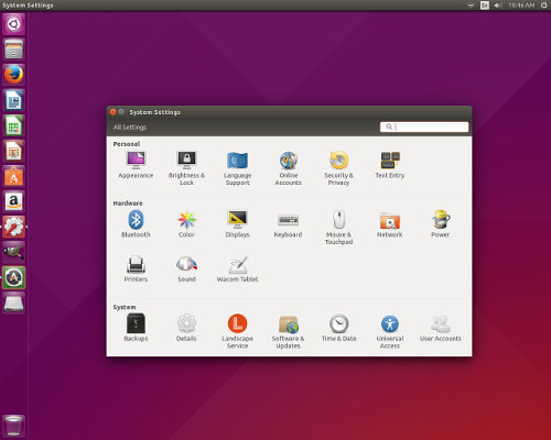
However, I’d suspect that everything here works just fine, as Ubuntu’s underlying tech is best of breed.
So far that’s been true. Within an hour or so of installing this vivid monkey, I opened the Settings screen to turn off the “Lock” function, so I wouldn’t have to enter a password every time I returned after walking away from the computer for a few minutes. That went just fine. Now I can go get a mug ‘o coffee without having to put my short term memory into overdrive.
Still, it looks way too much like Windows’ Control Panel.
Ubuntu Software Center
This is sort of a dumbed-down version of Synaptic, requiring very little from the user, and with a look and feel that’ll be familiar to anyone who’s ever looked for an app on Android. That being said, it seems to work very well. I used it to download and install GIMP, so I could edit the screenshots for this review. Easy peasy. Maybe the easiest install ever. I didn’t even have to click through a “we will make these additional changes” dependency screen. One click: Install. That was it. As easy as WordPress.
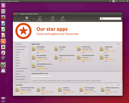
The trouble is, a visit to this package manager offers an experience very much like a visit to Netflix. Right away the user is greeted with suggestions based on metrics such as popularity, newness, etc. I’m a little surprised that there wasn’t a message that began: “Based on your recent downloads, we recommend…”
Something tells me that Ubuntu’s planning on monetizing apps when they get Ubuntu Phone off the ground.
So what do I think about Ubuntu 15.04?
As I know from using Ubuntu derivative’s like Mint and Bodhi, that the hard working coders in Canonical’s employ have worked long and hard to produce what is possibly the definitive implementation of GNU/Linux under the hood. This is an operating system that works, and works well. That’s one of the reasons why the distros I use on a daily basis are derivatives of Ubuntu.
But there’s a reason why I stick with the derivatives instead of going with what Mark Shuttleworth would like for me to think of as the “real thing.” You see, Ubuntu is like a car company that makes great engines but lousy cars.
That’s, perhaps, a bit unfair.
Let’s just leave it at this: Ubuntu 15.04, like previous versions I imagine, is a hybrid which attempts to be part Windows and part Android. Folks moving to Linux from either of those two operating systems will probably feel right at home with any supported version of Ubuntu, but only until they learn that they can have an even better computing experience with another Linux distro.
Christine Hall has been a journalist since 1971. In 2001, she began writing a weekly consumer computer column and started covering Linux and FOSS in 2002 after making the switch to GNU/Linux. Follow her on Twitter: @BrideOfLinux






i gave up on unity for one ready only. And it’s not all the Amazon sales pitches – which can be turned off btw. It’s because the workspace switcher is on the app launcher instead of the top panel where it belongs so I can click once on whatever dektop I wish to use. That’s it. Until they change it I won’t use unity. In fact ever since the days of when mate was still gnome 2 and unity wasn’t a thing yet, my gnome 2 desktop (and now my mate desktop) are configure like what you see in unity. The main panel on top with the menu button, workspace switcher and system tray on top as well as a left panel filled with my most used icons. Unity was so much like what I wanted a desktop to look like that I used it after gnome 3 came out but I couldn’t stand the extra effort I had to go through to switch work spaces. I still can’t stand it. Drives me nuts. My lmde 2 code named Betsy desktop is mate configured that exact same way. I also hve sparky Linux running open box, Compton, tint2 and plank with tint2 panel on top and plank filled with my favorite apps on the right. Also I have a minimal text based cocky output in the lower left corner with just basic system info (borrowed from crunch bag) such as memory, disk and cpu stats. But even in my openbox setup the desktop switcher is on the top. It belongs there. On click with a mouse and I’m at the new desktop or in e case of openbox, I can mouse wheel my way through them also. Unity doesn’t even have a mouse wheel option as far as I know. They get on my last nerve with making the simple things harder.
ready = reason.
The main Ubuntu release may not have changed much, but Kubuntu 15.04 is a different story. It comes with new KDE Plasma 5 Desktop. It is not quite ready for prime time yet, but I like it and find it good enough for my laptop.
We shall not speak of the early KDE4 releases.
the app launcher icon set can be made smaller by adjusting the desktop settings. I had complained about it before and I think you can take the icon size down to 20 but don’t quote me on the smallest size. It’s been a while since I tried it.
Hi Christine,
Excellent take on the latest Ubuntu flavor. I’m using Ubuntu 14.04 and liking its stability, but even after messing with 12.04…, I’m having trouble finding my installed utilities and personally generated scripts. (as a fall-back I keep a paper listing of them) Yikes!
Hopefully, someone back at Canonical can figure a way to improve the HCI (human-computer-interface) With Gnome 2 I could use a mouse for launching every app. No so with Unity–I have to type the name of stuff to find what a mouse used to find. Sometimes I can’t remember the name!!!???
Keep up your good work.
Nobody in their right mind would use a mouse to get to the other workspaces. Hold down Ctrl-Alt with your left fingers and use your right finger on the arrow keys to get you to your desired workspace. Easy peasy.
Hi Christine.
I think you’ll find Ubuntu has borrowed far more heavily from OS X than Windows.
The “Control Panel” that bothered you so looks almost identical to the OS X System Preferences.
https://www.google.com/search?q=system+preferences+mac
I personally don’t like Unity much and have recently settled on Mate (for now), but I’m sticking with Ubuntu for the moment. At least we have the option to switch to different desktop environments, distributions or even e.g. FreeBSD if we got too frustrated with what we’re using now.
Personally I quite like Ubuntu’s Unity, it’s quite simple to use, and the advertising can be easily turned off. I dislike Nautilus, which I replace with Nemo. The launcher can be made narrow enough that it doesn’t get in the way, even if you prefer to have it visible at all times (you can, of course, set it to auto hide). All this angst directed Unity seems rather pointless.
My non techie partner prefers XFCE, because it is, as she puts it, a simple desktop for a simple person.
Christine commented on how System Settings looks “way too much like Windows’ Control Panel.” She clearly believes that this is a bad thing.
I disagree with that premise, and here’s why.
We want people to start using F/OSS platforms. Usually they’ve used MS Windows. If we look reasonably “close enough” to that, while giving a better experience, people are more likely to actually try us. That’s a win. For this reason, I tend to set up people with Kubuntu…precisely because it kinda “looks like Windows.”
Unity on a tablet or phone, on the other hand, is a fine idea, and that’s where I believe it shines best. I eagerly look forward to Ubuntu phones coming to this country.
–SYG