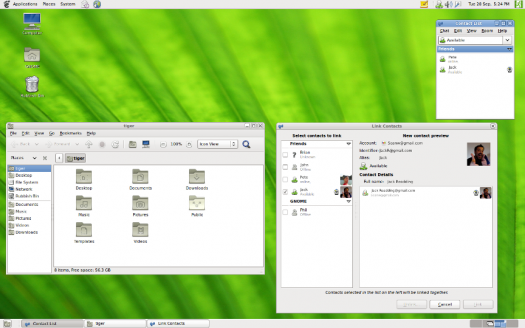
Eight years after the Gnome 2 desktop was replaced by Gnome 3, the older desktop environment remains one of the most used interfaces on desktop Linux.

Gnome 2.0 was first released on June 26, 2002. Seventeen years and a couple of reincarnations later, it remains one of the most popular and longest-lived desktop environments for Linux.
A handful of window managers, like IceWM and Ratpoison, are older than Gnome, but are less widely used. Similarly, Trinity, the successor fork to KDE 3, is a year younger and used by a few aficionados. Gnome 2, though, has a recognizable descendants in Gnome 3’s fallback mode, extensions through which it can be closely duplicated, and in Linux Mint’s Mate, which began as a fork of Gnome 2’s last release.
Exactly how many use one of these descendants has never been tallied, but the total is likely enough to place them as a group among the half dozen leading desktop environments today. Looking at this continued popularity, I have to wonder why, and the possible answers suggest what a majority of users look for in a desktop environment.
Even in 2002 Gnome 2 had little that was original. It offered a standard interface, with a desktop, panel, and menu, like the one that Windows 95 had introduced seven years earlier. Today, as with other major DEs, Gnome 2’s interface is obsolete. Its menu is particularly poorly suited to the massive content of modern storage devices, requiring endless clicks that are only tolerable because users have adjusted to them gradually.
The most praise that could be given Gnome 2 is that, along with KDE 3, it marked the point where desktop environments for Linux achieved a rough parity with their proprietary equivalents. Although new releases would come out every few months or so for the next decade, the basic functionality remain unchanged. In the next major release, Gnome would have no where to go except in a new direction.
Perhaps that lack of originality is exactly what makes Gnome 2 so long-lived. “Intuitive” is a carelessly and over-used word when interfaces are discussed, but as far as it has any meaning, it refers to a design that is familiar. In that sense, Gnome 2 and its survivors are intuitive. The fact that Gnome has always tended towards a minimalist design philosophy makes it even more intuitive. What that means is that if you used most versions of Windows over the last couple of decades, you can adjust to Gnome 2 and its survivors in a few minutes. It will be familiar and unsurprising — and a considerable aid to those trying Linux for the first time.
In fact, the familiarity is so great that there are videos on Youtube explaining how to make both Gnome 3 and MATE look like different versions of Windows (or the other way around). The resemblance is not perfect, yet the fact it can be done at all emphasizes how similar Gnome2-like DEs are to Windows.
What I Really, Really Want
However, that seems to be only part of the reason for Gnome’s continued popularity. After all, the same familiarity is also found in Cinnamon, KDE, LXDE, and Xfce. I suspect that an even more important reason for Gnome 2’s popularity is that it refelects what modern users look for in a DE.
As far as they are able, most DEs tend to develop an ecosystem of applications and utilities. In the case of Xfce, that ecosystem is limited, but in most popular ecosystems, such as Gnome and KDE, the ecosystem consists of hundreds of pieces of software. The size of the ecosystem may add to the familiarity of a popular DE like Gnome 2, allowing users to quickly learn applications as well as the desktop.
Around the turn of the millennium, DEs only offered their own ecosystem. In addition, they offered different ways of working. For instance, during the first general release of Gnome, its developers were officially working towards a Gnome Office. They got as far as AbiWord and Gnumeric, but around the time that Gnome 2 was first released, the release of Sun’s OpenOffice.org (the precursor to Apache OpenOffice and LibreOffice) meant that Gnome Office no longer served a purpose, especially when so many other pieces of functionality were needed.
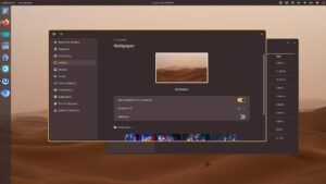
KDE’s ecosystem continues to include customizations, such as hot spots and Activities. Gnome 3 also defaults to a different layout, with applications launched in the overview and used on the main stream. However, in Gnome 2 the emphasis is not on the customization of the workflow. Instead, once files and applications are selected, Gnome 2 recedes into the background. As you work, the fact that you are working in Gnome 2 is of no importance. It is basically an application launcher and only comes to the forefront when you log in or out, or launch another application. It does not determine how you work the way the Gnome 3 overview or a KDE Activity does.
Considering the user revolt when Gnome 2 was replaced, or even the hostile reception of KDE 4, I suspect that Gnome 2-like DEs remain popular because a launcher is all that a sizable number of users want. Not all users, certainly, want the same thing. About a third of Linux desktop users favor KDE. However, perhaps as many just want a launcher. If so, they find exactly what they want in Gnome and its survivors. Moreover, because of Gnome’s size and decades of development, they can also have the ecosystem that DEs like LXDE and Xfce lack.
The Linux desktop only recently recovered from the fallout of the Gnome and KDE user revolts, and the idea of developing a future desktop is perhaps less urgent or exciting in today’s world of cloud applications than in days past. Still, the next time desktop developers decide on major innovations, they might look at how Gnome 2 persists and concentrate on simply providing a launcher. After all, that is all many users seem to want.
Bruce Byfield has been involved in FOSS since 1999. He has published more than 2000 articles, and is the writer of “Designing with LibreOffice,” which is available as a free download here.


Typo: “Trinity, the successor fork to Trinity 3” should say “KDE 3”.
Thanks for the heads up!
Yes. A launcher… and a competent file manager.
I use the Mate desktop since it is more like Gnome 2 to me. I like XFCE4, but, the Mate Desktop is just a bit more comfortable. No mater how hard I have tried, I cannot like the Gnome 3 Desktop. KDE I just don’t like. I’m not trying to bash Gnome 3 or KDE, but, I prefer the “just works” of Mate or XFCE4.
For me, it was because personal customization was easy and irritated that I would have to learn more things just to get my desktop back to what I had it designed for.
I had my desktop designed exactly how I liked it for my personal workflow when Ubuntu went to the Unity desktop and Gnome3 came around and it was near impossible to recreate my desktop. It’s do-able now (wasn’t then) but is a pain to get to what used to be simply done. So now I ‘m an XFCE user instead. And would still prefer Gnome2.
Sources would be good. I am wondering how you determined use, verses distributed.
Also, good to see this site back up, I feared it was dead, and still wonder about other writers such as Ken and how they are doing.
When Gnome 2 went away to be replaced by Gnome 3, my desktop went from being alive with menus and icons to being empty. Absolutely empty. There was no obvious way of doing anything. No way to run any of the programs that I knew were installed on my computer. Heck, I couldn’t even figure out how to log out or turn the computer off. Eventually, I went to a different computer so I could log in using SSH and issue the shutdown command. That let me start a different environment.
This “ease of use” impressed me. Not.
Eventually, I found out what the heck was going on. I had to go on-line and search around for the basics of getting started. That’s important. One of the essential elements of GUI design is explorability. You can explore the logical space that makes up your computer, and it’s not something Gnome 3 had, not at first. I last ran it on a computer the last time I installed Debian, so I don’t remember what it’s like now. I’ve since made my peace with Gnome 3, at least well enough to install and select something else.
I’ve maintained for decades that GUI’s are easy to learn but not necessarily easy to use. Gnome 3 reversed that, I guess. I don’t find it particularly easy to use, but it seems impossible to learn. Basing your experience on searching is awesome, but only if you know what you’re searching for. For the rest of us, there is a menu. Even if I don’t know precisely what each entry does, I at least know what my options are.
In a sense Gnome 3 replicates in a GUI the precise experience of running a command line, without all of the really cool things a CLI can do, like being scriptable. Since I already have CLI’s on my system that run inside the GUI, and since they’re real CLI’s with all the cool stuff attached, I find Gnome 3 to be a waste of disk space.
As far as a desktop environment being just an application launcher, well, just what do you think a desktop environment’s job IS? If you fail at job #1, nobody cares of you’re the absolutely best at job #10,000.
Well said Jonathan!!!
Linux desktops are going the way of Android, every update makes something different, not better, just different. Can’t actually think of any that made my phone work better!
Gnome 3 is not productive in my opinion, the way of grouping windows, the alt+tab, the empty desktop, the taskbar…
I think the most linux desktop users are not just regular users, but developers, administrators, so gnome 3 makes it difficult to use day-by-day.
I stick to KDE.
As a person with compound disabilities (vision & hearing) I can easily say KDE is at the forefront of accessibility amongst the Linux DEs.
Mate / Gnome 2 is stuck in an era where unless you had just the right disabilities you simply have to suffer.
I use Xfce because it’s solid, uses few resources, and stays out of my way.
I loved Gnome 2 and could not understand why Gnome 3 had the design it did. Yes, I want a launcher! I want a desktop panel that is easy to configure and can dock user created icons to reach any file, app, or URL of my choice. I do 90% of my computer work with one click from an XFCE panel. And XFCE has the ability to save my panel layout so I can reproduce it instantly on other computers. (Well, that worked on Ubuntu 16.04 but is broken in Ubuntu 18.04) I felt that Gnome 2 was asking me how I wanted to work. Gnome 3 was telling me how I had to work. Not going to happen.
Jonathan said this:
” Basing your experience on searching is awesome, but only if you know what you’re searching for. For the rest of us, there is a menu. Even if I don’t know precisely what each entry does, I at least know what my options are.”
and it is so, so true.
I use KDE on my primary machine. I stuck with the 3.x series for awhile after the 4.0 release because 4.0 was a damn mess, but KDE has since course-corrected. (Not for nothin’, unlike GNOME, they mostly rolled back the experimental UI elements they’d introduced in 4.0 and went back to a more traditional desktop design.)
I use Xfce on several other machines I’ve got around the house that have lower specs.
And I use GNOME on the HTPC I have set up in my living room. I think it’s a good desktop for a media center, and I expect that with some tweaking it will eventually be a good desktop for touchscreen devices. I don’t much care for it as a desktop UI.
It bears noting, of course, that many distros’ out-of-the-box GNOME experience is not vanilla GNOME. Many distros ship it with tweaks that make it a bit more like a traditional desktop — restore the desktop, always show the dock, show standard window decorations (minimize/maximize/close), etc.
Gnome 3 vanilla is not clever, it is awkward… But after 3 extensions and little tweaks, in 5 minutes it ok, with a taskbar and productive menus and icons…
But what is REALLY important is WAYLAND… This is the WAY… Xorg is not acceptable for anyone concerned about security… Wayland is the future and for now just Gnome 3 is 99% compatible…
In XORG any app can log everything of other apps being typed… This is a nonsense, any browser tab logging others, for instance…
I miss Gnome 2. I loved it before Gnome 3. Now I am KDE user.
“If it ain’t broke, don’t fix it”. Long live Gnome 2, the best of the best!
What I want is a touch based launcher on my phone/tablet and a keyboard/mouse based launcher on my computer. I do not want to use a keyboard and mouse on my pone or use a touch screen on my computer. The devices are designed for two different workflows. Gnome3 with some mods would be a good DE for a tablet/ phone. Gnome2/cinnamon/kde are great DE’s for Desktops. Until my desktop is one large tablet and laptops do not need a keyboard, We NEED BOTH types of launchers/DE’s. When Gnome3 has a desktop mode and a tablet mode I will start to use it. Until then I will stick with Android on my tablet/phone and Mate on my desktop.
Regardless of operating system, most people just want a desktop to act like a desktop. Taskbar, launcher, and then get out of the way. Windows 95 got it right. KDE 1/2/3 got it right, as did GNOME 1 and 2. Apple got close. Then all of them have been screwing it up ever since. We want a desktop to act like a desktop. Not a phone, not a tablet, not anything other than a desktop. Get it right.
I won’t lie, I actually like GNome 3….I like the layout…the “suspended” windows, the no bottom taksbar look the launcher, everything about it appeals to me. And while I used Gnome 2 for a long time?…I prefer 3, it just suits me. I guess the real joy of using Linux and Open source software?….is that you’re free to use whatever it is that you feel the most comfortable with.
KDE Plasma, Cinnamon, and the Deepin Desktop Environment are where it is at for me. Xfce is pretty good too. Modicia OS and MakuluLinux have both managed to make Xfce seem like something new with the applied tweaks, respectively.
Plasma Active showed some serious innovation. It seemed to be very close to being ready for prime time right before its demise. I think desktop Linux, as well as the mobile variety, suffers a bit from little or no marketing. In some cases just poor marketing.
Gnome 2 is popular because it works and the ‘traditional desktop is familiar to everyone. People often resist change. Windows 8 received much the same reception from its user base as KDE Plasma 4 and Gnome 3 did from the FOSS Community.
Windows 10 was Microsoft’s response to the backlash. I don’t see much by way of innovation in Windows, either. It would appear innovation is a victim of the catch 22. After all it’s the user that uses the system so why shouldn’t they have a voice.