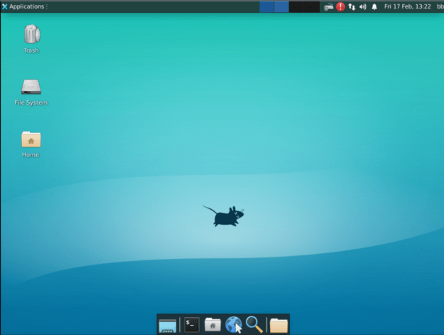
When Xfce 4.18 was released in December, many of the desktop environment’s users might not have noticed many changes. That’s because most of the changes were under the hood, and its popular file manager, Thunar, went through a major overhaul.
These days, Xfce is hard to miss. In some distributions, it is the default desktop environment, and few do not offer it as an alternative. In user polls over the last decade, it is consistently a close second to KDE’s Plasma. Advertising itself as fast, lightweight, visually appealing and easy to use, Xfce has become one the leading Linux desktops, with a popularity that shows no sign of waning.
Which of these Linux Desktop Environments and Window Managers would you most prefer to use?
Total Voters: 375 |
It wasn’t always that way. Founded in 1996 and originally based on the Common Desktop Environment (CDE), Xfce spent half its existence as a distant third to GNOME and KDE which constantly vied for first and second for popularity in user polls.
Then, about a decade ago, something unexpected happened: users revolted against the innovations introduced by KDE 4 and GNOME 3. Users wanted an alternative, and Xfce was a mature option with a traditional desktop without pre-conceived notions of how users should work. In the space of a year or two, GNOME and KDE’s joint monopoly of the desktop was shattered, and Xfce emerged into its current prominence, eclipsing even Linux Mint’s MATE, a fork of the popular GNOME 2, a desktop environment comparable to Xfce and benefiting from the nostalgia that ignited the user revolt in the first place.
Amid these community politics, Xfce’s developers continued as always, with the same goals and modular construction as before. Even the spacing of releases has not changed — as the project’s current home page notes, the recent 4.18 release comes almost two years after the previous one. However, the external perception has changed drastically, and not just become of Xfce’s popularity.
For one thing, Xfce began in an era in which desktop environments provided all their own apps (an area in which Xfce, despite some notable apps, never fully competed with GNOME or KDE, possibly because of a relative lack of developers). Today, though, many desktop environments concentrate on being application launchers, and bare-bones window managers and tiling desktops are enjoying a revival. As a result, although Xfce still describes itself as lightweight, that term only really applies among traditional desktops. Increasingly, Xfce is viewed as a middleweight interface, lighter than GNOME or KDE, but heavier than LXQT or IceWM. The change in perception is worth mentioning, because it might create misleading perceptions, even though Xfce remains much the same as ever.
Enhancements of a Mature Desktop
Released December 15, 2022, the 4.18 release is a mature desktop. So much is obvious at a glance, and becomes even more so looking at the release notes. In fact, it is difficult for a casual observer to tell the differences between 4.18 and the previous 4.16. Many of the changes are cosmetic, such as a simplification of the layout of the Settings Manager. Others are not immediately visible to casual users, such the merger of two different tools for displaying thumbnails, and the combination of the date and time plugins, or the improvement in the display of some previously blurry icons. Such changes are conscientious, but only affect the user experience in minor ways.

Other improvements have a greater effect. For instance, a new filename dialog warns of invalid filenames as they occur, while a shortcut editor lays the groundwork for navigating the entire desktop, although for now it only works in a few applications. The clock plugin now supports four displays: Analog, Binary, Digital, Fuzzy and LCD, which is a relief for those of us who dislike the unnecessary precision of a digital display. None of these changes result in any deterioration in performance.
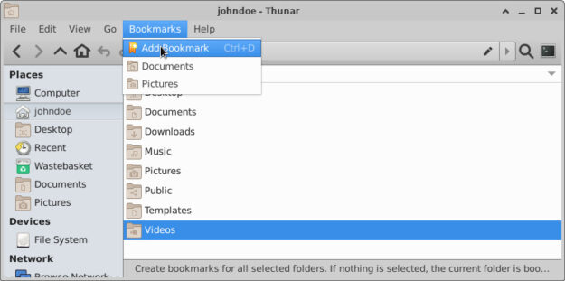
The Thunar file manager has long been the flagship app of Xfce, so it is unsurprising that many of the changes in 4.18 give Thunar particular attention. Among the numerous changes are options for a configurable toolbar, a split view, a side pane that includes recursive search and the opening of recently viewed files, the ability to create custom sub-menus, and the repositioning of the Bookmark menu as a top-level item, which has the advantage of making this useful menu more visible and more accessible. In addition, the status bar and Trash have been redesigned to be more informative. All in all, it’s an extensive overhaul of an already useful app, and I would recommend that users take the time to familiarize themselves with all the improvements so that they are not missing out. In fact, those who do not use Xfce might consider taking advantage of its modularity to install Thunar by itself.

The Middle of the Road
Whether Xfce suits you depends what you expect in a desktop environment. On the one hand, if you want still-experimental ways to work, like Plasma’s Activities, you probably will not be overly enthusiastic about Xfce. Similarly, unless you are working on an older computer or one with limited resources, there are probably better choices for an interface. On the other hand, if you prefer a desktop whose main purpose is launch applications then get out of the way, it is hard to improve on Xfce. Xfce may not do everything, but then it doesn’t try to — and what is does do, it does outstandingly well.
Bruce Byfield has been involved in FOSS since 1999. He has published more than 2000 articles, and is the writer of “Designing with LibreOffice,” which is available as a free download here.


I’ve use Xfce for years and it does the handling of the desktop perfectly, it gets out of the way so you can work efficiently.
KDE is quite beautiful but OMG so many options, just way too many whereas Xfce has some but easily discovered.
Former KDE and GNOME user here. After what they did with versions 4 and 3, respectively, I switched to Xfce. I love how Xfce has never, in its entire history, thrown you for a loop and forced you to re-learn how to use your desktop, not that I’m aware of, anyways. Can’t say the same for KDE or GNOME, not to mention that virus that masquerades as an OS that shall not be named.