The debate over whether KDE or GNOME is the better Linux desktop has been going on since before the turn of the century. Actually, it boils down to choice and what works best for you.
SOURCE: Pixabay
Novelist Hugh MacLennan once described Canada as “two solitudes” — an English-speaking one and a French-speaking one, neither of which had much to do with the other. The description is decades out-dated, and today a dozen solitudes might be more accurate. However, the phrase echoes in my mind whenever I think of the gulf today between GNOME technologies and KDE software compilations. Although both are based on the Linux kernel, the expectations and philosophies are different enough that they might almost be different operating systems.
The difference has not always existed. When GNOME and KDE began in the late 1990s, both were scrambling hard to match desktops on other operating systems. Widgets aside, the differences were minimal. For years the two graphical interfaces regularly traded places on reader surveys, with perhaps a slight edge for GNOME, depending on the magazine or site conducting the survey. Flame wars could be fierce, but like many flame wars, the fierceness reflected how trivial the differences mostly were — at least, after KDE’s Qt toolkit became free software. The difference was largely one of branding.
Still, GNOME and KDE each slowly developed its own ecosystem of applications. A few applications like OpenOffice.org were shared, presumably because developing alternative for large applications was difficult. Moreover, the popularity of some apps like Firefox overwhelmed native alternatives like KDE’s Konqueror. But in categories like music-players, archivers, and CD burners, each slowly started to developed its own set of tools.
The Road to Today
Differention accelerated midway through the first decade of the millennium. At that point, both GNOME and KDE had caught up with Windows, and each decided that the next step was to become a leader in desktop innovation. Broadly speaking, KDE 4.0, released in 2008, focused on adding features and logic that offered new productivity tools or extended basic tools. For example, the desktop had widgets added to it as well as “Activities,” multiple desktops that allow task-based work-flows, as well as other feature that allowed countless customizations.
By contrast, GNOME designers began the 3.0 release of 2011 with the concept of removing clutter from the desktops. Freshly installed, the GNOME desktop launches apps from an overscreen and runs them in system-managed virtual workspaces. Even more so than KDE, it pushed users to work in non-traditional ways.
The Linux Foundation Second Half Sale has been extended until July 31, 2026. Save 40% on Bundles: Use code JULY26BUN Save 35% on Courses and Certifications: Use code JULY26CC
Both releases were examples of how not to introduce innovation. Distributions pushed KDE 4.0 into their repositories before it was ready for general use, while GNOME 3.0 was too strict in the limitations it imposed on users. KDE responded to the criticism in the next two releases, and managed to retain most of its users. GNOME, however, was reluctant to abandon its vision of how its designers thought users should work. By the time GNOME released extensions that restored customization and allowed a Gnome 2 desktop under another name, much of its user base had moved on to other desktops, including Linux Mint’s GNOME-based Mate and Cinammon desktops. Many did not return.
Few deserting GNOME users seem to have considered KDE. Desktop-hopping became common, with most settling on desktops that used GNOME applications. Ever since about 2012, polls have regularly shown that while KDE Plasma has remained the single most popular desktop, used by 27-35% of Linux desktops users, GNOME apps are used by perhaps two-thirds of desktop users — although not usually the GNOME desktop. Few of each group of users have more than a passing idea of what the other is about.
Design Philosophies
After two decades, the differences between the two desktops are distinct. For instance, in order to eliminate desktop clutter the Gnome desktop discourages icons, while Plasma encourages a mixture of commands, URLs and folders on the desktop in order to customize Activities for specific tasks. An Activity for writing, for example, might have icons for storage folders, and URLs for a dictionary or thesaurus. Similarly, while GNOME’s overview locates and launches applications, Plasma’s displays all Activities. Plasma also has what I call a setup mode, from which settings can be altered directly from the desktop — something that has no counterpart in GNOME. And even with extenstions, GNOME does not match the customizations found in Plasma, which are so numerous that some users report discovering new ones after years of use.
** If our coverage matters to you, please consider supporting our work through our FOSS Force Independence 2026 fundraiser. **
However, the most obvious difference is in general design philosophy. GNOME is built on a minimalist philosophy, its windows displaying only the most commonly used functions, all thoughtfully positioned in relation to one another. The opposite approach is taken in Plasma, with each app containing all the tools that could possibly be needed for both the main purpose of the app and any possible side-purposes as well. In the past, this completist approach has sometimes left Plasma with some chaotic interfaces, including tabs marked General that were dumping grounds for features that do not fit somewhere else.
Today, though, Plasma has had several years of improvements by its design team, and the standards of interface design are markedly improved. digiKam, for one, is so well-designed that it actually has several sub-systems for managing and editing images, each with its own window.
The two philosophies often spill over into each ecosystem of apps. For example, both Rhythmbox and Amarok are music players, with all the tools needed to play and manage audio files, including play lists and ratings. However, Rhythmbox has few features beyond those basics, making it easy to learn from scratch. In every way, it is an intuitive applications, one that anyone with basic desktop experience can open and start using.
Rhythmbox music player
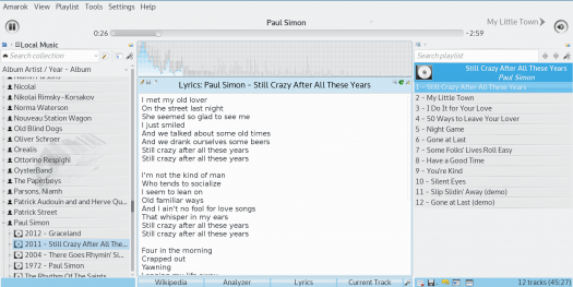
By contrast, Amarok does all that and more. In order to reproduce the experience of playing music at home, it has a context bar in the middle, where Wikipedia entries and concert calendars and links to lyric pages do their best to reproduce the experience of hard copy albums. It also includes plugins for easy access to podcasts and streaming services, a cover collection, and a mood bar that changes colors to fit the music. None of these features is essential to the basic act of listening to music, but those who want such features can have them.
Amarok music player
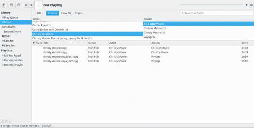
Compare other longstanding apps, and the different philosophies are just as obvious: K3B to Brasero, Okular to Evince, and many more. In both cases, the whole point is to provide a uniform computing experience, and modern GNOME and Plasma both do so with painstaking thoroughness.
A Matter of Taste
Together, Plasma’s competist apps and GNOME’s minimalist apps leave only limited space for standalone apps. Increasingly, your desktop determines your toolset and your work-flow. It is unsurprising that switching between GNOME and Plasma is relatively rare, because if one set of apps suits you, the chances are that the other one will not.
Both GNOME and Plasma have grown greatly in sophistication in the last fifteen years, and the old criticisms of them have long ago ceased to apply. The next time someone — probably a Mac user — accuses the Linux desktop of poor design, tell them to look up the differences between GNOME and Plasma. Considerable experience has gone into improving the Linux desktop in recent years, and the result is two well-differentiated choices. And if you have been using one of these choices for a few years, take the time to look at the other one. You may be surprised by what you see.
Bruce Byfield has been involved in FOSS since 1999. He has published more than 2000 articles, and is the writer of “Designing with LibreOffice,” which is available as a free download here.
I think any desktop environment is most productive when you use hotkeys for navigation and least productive when you use the mouse. I think the magic of the default GNOME 3 experience, if there is any, is that mouse-based interaction is completely possible but so slow and awkward that it pushes you hard towards using hotkeys. GNOME 2, KDE, Xfce, Ubuntu Unity, etc… etc… are just as fast and useful with hotkeys but mouse control is convenient so most users never learn the hotkeys.
But when GNOME 3 came out I didn’t appreciate hotkeys, so I just found the mouse-based interactivity frustrating. I switched desktops.
I’ve always found KDE beautiful and easy to use, but my personal experience is that it’s more crash-prone than GNOME, Xfce, Lxde, etc… Hopefully newer versions are better, I haven’t tried it in quite some time.
Mike
May 20, 2019
I haven’t spent a lot of time with KDE as I found it too resource intensive for my taste.
I strongly dislike Gnome though. It suffers from a number of problems including: resource usage, a ridiculously prescriptive approach forcing users into the authors’ idea of the correct workflow, oversimplifying of user options, and over complicating system interaction and dependencies, i.e. systemd.
I prefer simpler (in terms of resources and dependencies) software that doesn’t try to tell me how things should be done. I use the window manager awesomewm. It’s lighter, faster, and more flexible than any desktop environment I’ve ever tried. I can adapt it to my needs as those needs change, and I am free to experiment with new workflows when I feel the need, without being hostage to ‘the one true way’ that someone else dreamt up.
For potential UI designers, I’ll add this bit of advice: It is possible to provide sane defaults to reduce complexity for the majority of users while still granting flexibility for users who want something different than what the you feel is optimal. You may feel you know the best way to use your software, but you don’t. Don’t make your software prescriptive in its usage. It’s ALWAYS the wrong choice.
“I haven’t spent a lot of time with KDE as I found it too resource intensive for my taste.”
You should strongly reconsider KDE, as it has become one of the lightest desktops around. Resource usage from what I’ve read and seen is often on par with xfce and far below Gnome.
Mike
May 20, 2019
Deppman,
Still too much for me. Get it below 50MB and I’ll take another look.
I use different desktops on different computers — KDE on my main machine, GNOME on the HTPC hooked up to the TV in my living room. And it’s precisely because of the design philosophy differences described in the article. I want KDE’s customizability on my workstation; I want GNOME’s simplicity on a machine that’s there to launch games or videos and then get out of the way.
I also have 3 desktops that use Xfce because they have older or lower-end hardware.
I see people complain about fragmentation on the Linux desktop. Me, I think having a broad range of choices is great. Different desktops are useful in different circumstances.
Grant
May 20, 2019
I still use gnome because I don’t like changing desktops. However, I hate gnome developers with a passion as they seem to have done some surveys on how old grandmas use computers (not using desktop icons, having only one screen move by default when you switch virtual desktops, for example) and then tried to force the rest of us to work that way. Their hubris is crazy. I’ve learned to tweak things to make it kind of work but gnome will forever be, for me, the example of how even an open source project can be taken over by bureaucrats that feel that they shouldn’t care what the users want or need.
Emery
May 20, 2019
Now KDE’s Qt toolkit has found a home on the lightweight Lubuntu LXQt desktop. which handles heavy LibreOffice files with remarkable alacrity.
To me, it’s the first contender I’ve found for Xfce.
Vaishali
May 21, 2019
I like KDE and GNOME, but KDE applications like Okular is slow and not suited for epub and pdf files, many epub files do not open with OKular, gnome-books does a good job of opening epub files though it needs more features like option to select fonts, evince is better than okular.Browsing on GNOME is smoother than KDE on my hardware.
Jim
May 21, 2019
Quote: “GNOME is built on a minimalist philosophy, its windows displaying only the most commonly used functions”
Most commonly used functions. For whom? Certainly not for me. Every desktop is individual. Yours would probably slow me down, mine would probably slow you down. More than likely no one uses the most common most often. While I loved Gnome to no end at one time, I now have little use for it (and yes I tried) and use Mate. I find KDE bloated, but use Kpat, K3B and Krita with no problems.
Joe
May 21, 2019
To be honest, you lost me at the start when you said “both are based on the Linux kernel.”
Mike
May 21, 2019
@Joe
LOL, good catch.
Torin Doyle
May 21, 2019
I like neither. I opt for MATE (main PC) and Xfce (other PC).
Marc
May 22, 2019
I think the war on “amazing effects” is over now. KDE fell into this hype with all its weigh and might. It was ridiculous. It still is ridiculous.
We all saw the change around 2005 when everything was simple, blazing fast and convenient. This era has disappeared. And it is a shame.
Trading productivity for “beautification” .
However I agree with Mike. Your desktop environment is the one you feel comfortable with. What make you interaction from the keyboard and from the mouse less time consuming. Shortcuts keys also are crucial for productivity.
In the other hand if you are just a “user”, effects are the most competitive thing to compare with… No matter if you have to have 25 gazillions bytes of RAM monopolized. A power greedy CPU that demand 400 W to do the same things as those who are fit and intend to stay that way and who are usually also productive. Gluttony in computing is a pain.
Marc
May 22, 2019
May I add that there is no “productivity distro” per se. Most are embedded in “a beautiful desktop environment” Come on guys. Get real. Stop being “eye candy”. However it did not answered the question on why “Linux” is not taking over Zindows as a productivity desktop. So that was a lot of work for pretty much nothing IMHO.
YGW
May 22, 2019
If anything, the debate is which one is less obnoxious and contributing less to keep Linux’s presence in the desktop negligible. They are both resource-hungry monsters; they both get constantly in the way, rather than staying in the background ready to nimbly do what you tell them do; they both insist in being the stars of the show – their way, or no way. Gnome is particularly extreme in this respect, which makes the worst. However, neither of them is that great, and with them as flagships, Linux in the desktop is doomed to remain the footnote that it is.
Marc
May 22, 2019
@ygw I did not understand what you tried to say. But it looks like troll. Let me troll too. Linux is superior to Zindows in many ways. The proof being how M$ is sneaking into everything Linux. Integrating it in its own OS (absorbing) But hey they first tried to copy Apple. So that is not uncommon from them to be… Shitty. Nonetheless, it sucks and I see it as a direct threat to the freedom GNU/Linux has offered to the world since its very beginning.
The “amazing” look and feel on desktop was indeed an attempt to make it more appealing to the mass. It did not work. Next.
Joe Beach
May 22, 2019
I liked Unity quite a bit because I thought they did a good job of utilizing screen space on 16×9 laptop screens. I currently run Unity on Ubuntu 18.04, but I am becoming bothered by the Gnome applications constantly paring down menu features. Getting rid of the normal “File Edit View…” in the window bar and replacing it with the “hamburger menu” with minimal options has particularly bothered me. Unfortunately, this design has cascaded to all of the other desktops that use Gnome applications. Do the KDE applications keep the traditional menu listings?
Sum Yung Gai
May 23, 2019
While I generally use KDE because it fits my particular workflow tendencies better, I’ve got no beef against GNOME at this point. Matter of fact, the Purism phones are slated to have GNOME as the default desktop environment, which I’m told is better for smartphone screens. Xfce is another good desktop which is relatively lighter on resources, and I’m known to use that one on desktops and laptops.
Remember that, regardless of desktop choice, you can run GNOME apps on, say, KDE and vice-versa, provided that the libraries are present.
It all boils down to personal choice. That’s the beauty of software freedom; we have that choice.
@SYG: I think “GNOME is better for smartphones” is a bit reductive. It *does* seem like GNOME 3 followed some smartphone design cues — hot corners, fullscreen app launcher, deprecation of text-based menus in favor of icons and hamburger menus — but it’s not really a good phone interface out of the box; it’s not designed for fullscreen apps, its notification bar still requires clicking on small icons in order to access notifications and settings, etc. Purism is making heavy modifications to GNOME to make it more phone-friendly — there’s certainly nothing wrong with that, but it doesn’t make it any different from, say, Plasma Mobile.
I do think GNOME 3 has advantages for certain types of workflow; as I mentioned, I use it on my HTPC and I think it’s a better fit for that environment than KDE/Xfce/etc. But as a phone interface, it needs some work; it can be converted into one, but it isn’t one out of the box.


I think any desktop environment is most productive when you use hotkeys for navigation and least productive when you use the mouse. I think the magic of the default GNOME 3 experience, if there is any, is that mouse-based interaction is completely possible but so slow and awkward that it pushes you hard towards using hotkeys. GNOME 2, KDE, Xfce, Ubuntu Unity, etc… etc… are just as fast and useful with hotkeys but mouse control is convenient so most users never learn the hotkeys.
But when GNOME 3 came out I didn’t appreciate hotkeys, so I just found the mouse-based interactivity frustrating. I switched desktops.
I’ve always found KDE beautiful and easy to use, but my personal experience is that it’s more crash-prone than GNOME, Xfce, Lxde, etc… Hopefully newer versions are better, I haven’t tried it in quite some time.
I haven’t spent a lot of time with KDE as I found it too resource intensive for my taste.
I strongly dislike Gnome though. It suffers from a number of problems including: resource usage, a ridiculously prescriptive approach forcing users into the authors’ idea of the correct workflow, oversimplifying of user options, and over complicating system interaction and dependencies, i.e. systemd.
I prefer simpler (in terms of resources and dependencies) software that doesn’t try to tell me how things should be done. I use the window manager awesomewm. It’s lighter, faster, and more flexible than any desktop environment I’ve ever tried. I can adapt it to my needs as those needs change, and I am free to experiment with new workflows when I feel the need, without being hostage to ‘the one true way’ that someone else dreamt up.
For potential UI designers, I’ll add this bit of advice: It is possible to provide sane defaults to reduce complexity for the majority of users while still granting flexibility for users who want something different than what the you feel is optimal. You may feel you know the best way to use your software, but you don’t. Don’t make your software prescriptive in its usage. It’s ALWAYS the wrong choice.
In the old days, I preferred KDE. These days I use Xfce with no intention of using anything else anytime soon.
“I haven’t spent a lot of time with KDE as I found it too resource intensive for my taste.”
You should strongly reconsider KDE, as it has become one of the lightest desktops around. Resource usage from what I’ve read and seen is often on par with xfce and far below Gnome.
Deppman,
Still too much for me. Get it below 50MB and I’ll take another look.
I use different desktops on different computers — KDE on my main machine, GNOME on the HTPC hooked up to the TV in my living room. And it’s precisely because of the design philosophy differences described in the article. I want KDE’s customizability on my workstation; I want GNOME’s simplicity on a machine that’s there to launch games or videos and then get out of the way.
I also have 3 desktops that use Xfce because they have older or lower-end hardware.
I see people complain about fragmentation on the Linux desktop. Me, I think having a broad range of choices is great. Different desktops are useful in different circumstances.
I still use gnome because I don’t like changing desktops. However, I hate gnome developers with a passion as they seem to have done some surveys on how old grandmas use computers (not using desktop icons, having only one screen move by default when you switch virtual desktops, for example) and then tried to force the rest of us to work that way. Their hubris is crazy. I’ve learned to tweak things to make it kind of work but gnome will forever be, for me, the example of how even an open source project can be taken over by bureaucrats that feel that they shouldn’t care what the users want or need.
Now KDE’s Qt toolkit has found a home on the lightweight Lubuntu LXQt desktop. which handles heavy LibreOffice files with remarkable alacrity.
To me, it’s the first contender I’ve found for Xfce.
I like KDE and GNOME, but KDE applications like Okular is slow and not suited for epub and pdf files, many epub files do not open with OKular, gnome-books does a good job of opening epub files though it needs more features like option to select fonts, evince is better than okular.Browsing on GNOME is smoother than KDE on my hardware.
Quote: “GNOME is built on a minimalist philosophy, its windows displaying only the most commonly used functions”
Most commonly used functions. For whom? Certainly not for me. Every desktop is individual. Yours would probably slow me down, mine would probably slow you down. More than likely no one uses the most common most often. While I loved Gnome to no end at one time, I now have little use for it (and yes I tried) and use Mate. I find KDE bloated, but use Kpat, K3B and Krita with no problems.
To be honest, you lost me at the start when you said “both are based on the Linux kernel.”
@Joe
LOL, good catch.
I like neither. I opt for MATE (main PC) and Xfce (other PC).
I think the war on “amazing effects” is over now. KDE fell into this hype with all its weigh and might. It was ridiculous. It still is ridiculous.
We all saw the change around 2005 when everything was simple, blazing fast and convenient. This era has disappeared. And it is a shame.
Trading productivity for “beautification” .
However I agree with Mike. Your desktop environment is the one you feel comfortable with. What make you interaction from the keyboard and from the mouse less time consuming. Shortcuts keys also are crucial for productivity.
In the other hand if you are just a “user”, effects are the most competitive thing to compare with… No matter if you have to have 25 gazillions bytes of RAM monopolized. A power greedy CPU that demand 400 W to do the same things as those who are fit and intend to stay that way and who are usually also productive. Gluttony in computing is a pain.
May I add that there is no “productivity distro” per se. Most are embedded in “a beautiful desktop environment” Come on guys. Get real. Stop being “eye candy”. However it did not answered the question on why “Linux” is not taking over Zindows as a productivity desktop. So that was a lot of work for pretty much nothing IMHO.
If anything, the debate is which one is less obnoxious and contributing less to keep Linux’s presence in the desktop negligible. They are both resource-hungry monsters; they both get constantly in the way, rather than staying in the background ready to nimbly do what you tell them do; they both insist in being the stars of the show – their way, or no way. Gnome is particularly extreme in this respect, which makes the worst. However, neither of them is that great, and with them as flagships, Linux in the desktop is doomed to remain the footnote that it is.
@ygw I did not understand what you tried to say. But it looks like troll. Let me troll too. Linux is superior to Zindows in many ways. The proof being how M$ is sneaking into everything Linux. Integrating it in its own OS (absorbing) But hey they first tried to copy Apple. So that is not uncommon from them to be… Shitty. Nonetheless, it sucks and I see it as a direct threat to the freedom GNU/Linux has offered to the world since its very beginning.
The “amazing” look and feel on desktop was indeed an attempt to make it more appealing to the mass. It did not work. Next.
I liked Unity quite a bit because I thought they did a good job of utilizing screen space on 16×9 laptop screens. I currently run Unity on Ubuntu 18.04, but I am becoming bothered by the Gnome applications constantly paring down menu features. Getting rid of the normal “File Edit View…” in the window bar and replacing it with the “hamburger menu” with minimal options has particularly bothered me. Unfortunately, this design has cascaded to all of the other desktops that use Gnome applications. Do the KDE applications keep the traditional menu listings?
While I generally use KDE because it fits my particular workflow tendencies better, I’ve got no beef against GNOME at this point. Matter of fact, the Purism phones are slated to have GNOME as the default desktop environment, which I’m told is better for smartphone screens. Xfce is another good desktop which is relatively lighter on resources, and I’m known to use that one on desktops and laptops.
Remember that, regardless of desktop choice, you can run GNOME apps on, say, KDE and vice-versa, provided that the libraries are present.
It all boils down to personal choice. That’s the beauty of software freedom; we have that choice.
–SYG
@SYG: I think “GNOME is better for smartphones” is a bit reductive. It *does* seem like GNOME 3 followed some smartphone design cues — hot corners, fullscreen app launcher, deprecation of text-based menus in favor of icons and hamburger menus — but it’s not really a good phone interface out of the box; it’s not designed for fullscreen apps, its notification bar still requires clicking on small icons in order to access notifications and settings, etc. Purism is making heavy modifications to GNOME to make it more phone-friendly — there’s certainly nothing wrong with that, but it doesn’t make it any different from, say, Plasma Mobile.
I do think GNOME 3 has advantages for certain types of workflow; as I mentioned, I use it on my HTPC and I think it’s a better fit for that environment than KDE/Xfce/etc. But as a phone interface, it needs some work; it can be converted into one, but it isn’t one out of the box.