Vivaldi’s 5.0 release might be seen as the release of two browsers — one finely tuned for the desktop, and one designed for a wide range of Android devices.

When the Vivaldi browser folks sent me an email late in the day last week saying “we turn five today” my heart sank, because I’m the type of person who hates to have to offer belated happy birthday greetings. Turns out, the “we turn five” wasn’t really a reference to the browser’s age (although the browser did, indeed, have its fifth birthday in April of this year), but an announcement of the release of Vivaldi 5.0, the latest and greatest version of the Chrome-based browser.
Norway-based Vivaldi Technologies was started by Tatsuki Tomita and Jon Stephenson von Tetzchner, who is now the company’s CEO. Von Tetzchner was also the co-founder and CEO of Opera, and started Vivaldi as a virtual community after new owners at Opera shut down the My Opera virtual community. The community and browser company is named after the 17th and 18th century composer, Antonio Vivaldi, who’s widely known for his operas — for those who didn’t catch the connection.
Vivaldi 5.0 Desktop Experience
Vivaldi has been on a tear adding new features lately, and version 5.0 continues down that road. Lately we’ve seen Vivaldi add both a calendar and email client, to become a full fledged browser suite, much like Mozilla was before it slimmed down to become Firefox (although the Mozilla Application Suite still lives as the community developed and maintained SeaMonkey application suite).
With Vivaldi 5.0 more has been added for desktop users who care about the look and feel of their browser, which isn’t much of a surprise because the configurability of the browser’s color scheme and the like has always been a big selling point. With this version, the browser adds a dynamic new theme editor, along with the ability to share themes with other Vivaldi users.
“Although other browsers have themes, ours have a lot more to offer with more controls,” a company spokesperson told FOSS Force in an email.
The new browser also makes it easier for users to translate texts in other languages on-the-fly, with a new Translate Panel that will translate highlighted text instantly. Simply select the text, right click, and then choose “Translate Selection.”
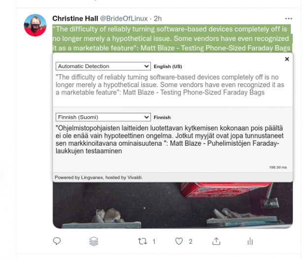
Vivaldi said it’s put work into making the translation feature work quickly.
“It is challenging to integrate a translation feature in a browser and make everything work quickly under a high load,” the company said in a blog about the new desktop browser. “So, a lot of work has been put in to reach this ambitious goal. With significant development and rigorous testing before the launch, the speed improvements will help provide you with faster translations.”
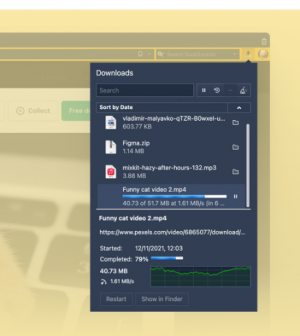
It must’ve worked. In our tests of the feature here at FOSS Force, we found responsiveness to not be an issue.
In addition, Vivaldi 5.0 offers users the ability to view downloads through a pop out box, in addition to the traditional way, which is through the panel on the screen’s left side. To choose a preference, users can go to Settings>Downloads.
Vivaldi on Android
Perhaps the biggest improvements made to Vivaldi are for Android users, starting with the first ever two-level stacked tabs experience for mobile devices, a feature that was added to the desktop browser earlier this year and which has now been tweaked specifically for the small screens on hand held devices.
“This includes having tabs appear smaller to give you faster access,” the company said in a blog for the Android release. “By removing the close button on all but the active tab, each tab can now become as small as a favicon, creating more room for more tabs.”
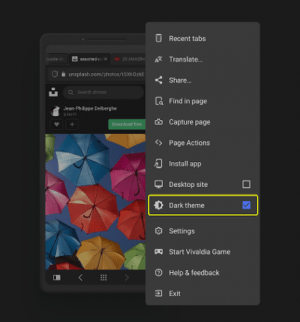
Improvements have also been made to the built-in Notes tool, which now allows users to add text from a webpage to an existing note with a new “Append to Note” option when highlighting text. And users can also enable or disable dark themes for specific webpages on-the-fly from Settings, which now contains a ‘Dark theme’ menu.
In the long run, one of the most important improvements to Vivaldi 5.0 for Android devices might be the way it deals with the different requirements between small screen devices, such as phones, and devices like Chromebooks and tablets with more screen real estate. This is something that many users say is keeping them from running Android apps on devices with larger screens.
A side panel that can be clicked in and out of view (which is almost a Vivaldi trademark on the desktop) is now part of Vivaldi’s mobile experience, where it might even be more useful than on desktops which have much more screen real estate and space is not at a premium.
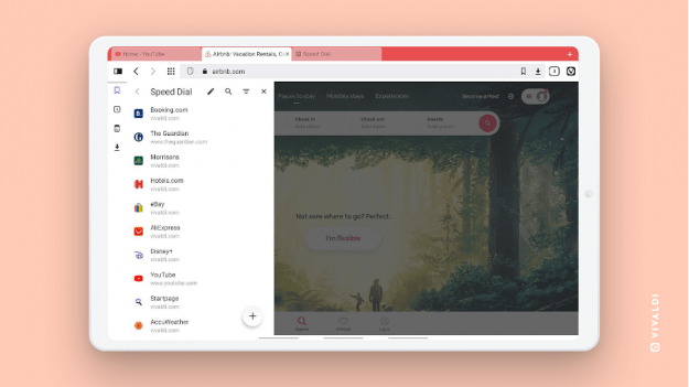
“Panels now pop up on the left of the screen, just like the default desktop configuration, to give you that familiar feel,” the company said. “Now, you can keep your go-to tools within easy reach in the browser’s sidebar. Work with your History, Downloads, Bookmarks, and Notes in split-screen with your main window. Toggling the Panel on and off is as easy as tapping the panel button in the top-left corner of the location bar. This makes better use of the screen space and facilitates more efficient workflows.”
Vivaldi’s Major Downside
Vivaldi does have one major issue that keeps some open source and free software advocates from adopting it: its license.
While Vivaldi is primarily built on open source, the entirety of the browser is not released under open source licenses, effectively making the browser as a whole proprietary freeware.
The good news is that Vivaldi doesn’t try to hide this fact like many previously open source data bases that have moved to “fauxpen” (for “false open”) licenses have done.
“Vivaldi is not distributed on an open source license like GPL3,” a Vivaldi spokesperson told us a month or so back in reply to our questions on the project’s licensing. “Although large parts are open source, like the Chromium code, there are parts that aren’t, but even most of the proprietary code can be read.”
“Most of Vivaldi’s source is available on our site for download, but again, Vivaldi should not be looked at as free open source software,” the spokesperson continued. “We have never claimed it is either, but have talked about the availability of most of our source code.”
Vivaldi is a good browser, and one I recommend, but open source users who don’t want anything but free software on their devices, should use something else.
Christine Hall has been a journalist since 1971. In 2001, she began writing a weekly consumer computer column and started covering Linux and FOSS in 2002 after making the switch to GNU/Linux. Follow her on Twitter: @BrideOfLinux




In Vivaldi browser, everything at first glance, thoughtful and convenient, but scares away a huge number of its settings. Many users have the feeling that this is done only for the sake of appearing to work hard on it. The huge number of its settings is an obvious disadvantage.
…
Simplicity is the highest level of art.
Bruce Lee.