KDE’s Plasma desktop environment, once considered something of a resource hog, has more features than ever and is Linux’s most configurable desktop, yet it’s as easy on resources as relatively lightweight desktops such as Xfce.
The KDE project develops one of the longest lived desktop environments for Linux and other open source operating systems. KDE was started in the mid-1990s and its name is a nod to CDE (Common Desktop Environment), which was a popular Unix desktop at the time.
Over the two-and-a-half decades of its existence, KDE has gone from being a single desktop which aimed to provide a consistent, friendly interface to become an entire family of associated software. These days it is a hub for several related projects, which include the popular KDE Plasma desktop environment, the Plasma Mobile interface for handheld devices, and a large collection of desktop applications. These applications range from simple text editors to messaging clients, from development tools to a file manager, and from video editing software to a web browser. It’s quite large collection of powerful, cross-platform utilities.
Because of the wide focus of the KDE project as a whole, and the way the various components fit together, it’s difficult to separate the KDE Plasma desktop from the many programs associated with it. In this review we’re going to explore the Plasma desktop and how it works, but also how other components of the KDE family fit together with this widely used desktop.
KDE Neon
One of the best ways to become familiar with KDE software, particularly the latest versions coming out of the KDE project, is to run a Linux distribution called KDE Neon (officially presented as “KDE neon”). The KDE Neon project publishes regular updates which feature Ubuntu as the core operating system with the latest version of the KDE Plasma desktop running on top. In this overview I’ll be talking about KDE Plasma 5.26 running on KDE Neon which uses Ubuntu 22.04 as its base.
KDE was one of the earlier projects to adopt the Wayland protocol. This means, on most Linux distributions we can choose whether to sign into the Plasma desktop running on the X11 protocol or on Wayland. Ideally the two sessions should be, from the user’s point of view, virtually identical. However, results may vary a bit between these two sessions, depending on the computer’s video card, hardware drivers, and which applications are being run.
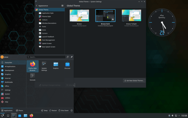
Upon signing into Plasma for the first time, a new user is likely to notice the desktop has a certain Windows-style layout. There is a thick panel across the bottom of the screen. This panel contains an application menu, any quick-launch buttons, the task switcher, and a system tray. The application menu has a two-pane layout with software categories displayed down the left side and launchers down the right.
What I find intriguing and attractive about Plasma is virtually everything can be changed and customized, including the general layout I just mentioned. There are two elements to Plasma’s famously flexible configuration: widgets and the System Settings panel.
Widgets
Widget are small, interactive components of the desktop. A widget is placed on the panel bar or on the desktop. A widget might be a small application or tool such as a clock, a battery monitor, a weather applet, or even the application menu. Most desktop environments have their own equivalent of Plasma widgets, items which can be added to a panel or to the desktop. What sets Plasma’s approach apart from the plugins available on most other desktop environments is Plasma widgets are, in a sense, aware of their role. The system knows the clock widget is a clock, that the application menu is a menu, that the weather applet checks the weather.
The reason this awareness is useful is we can right-click on a widget to bring up a menu of actions. These actions involve removing the widget from the desktop, configuring it, or moving it. Plasma also presents us with the option of selecting “show alternatives.” Taking this “alternatives” option shows us a list of other widgets Plasma knows about which perform a similar function. We can then select one of these alternative widgets, causing the original widget to disappear and a new one to take its place.
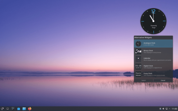
These alternatives make it possible to customize Plasma quite quickly. We don’t need to remove one widget and then search for another similar one, or browse long lists of widgets hoping to find one we like better. Swapping one out for another is just a few clicks, and the desktop filters down the options for us. If I don’t like the two-pane application menu, I can right-click on it and choose an alternative such as a tree-style menu or a full-screen grid of icons. If I don’t like the default digital clock, I can select an alternative such as an analog clock or one which prints out the time in words, displaying “quarter after three” as opposed to 3:15.
Which of these Linux Desktop Environments and Window Managers would you most prefer to use?
Total Voters: 375 |
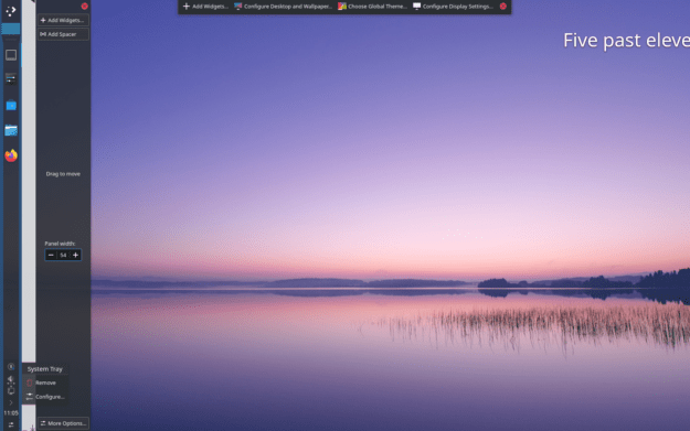
Further, the panel and widgets can be moved or resized with a few clicks. We can unlock the panel and drag widgets around its surface, swap them out for alternatives, and slide the panel to a new position with minimal effort. The Plasma desktop is not only flexible, it is designed to be highly interactive. Adjusting its look and style can often be done by manipulating its components directly rather than by using a separate configuration module where we try to outline what we want. With Plasma the configuration experience is often both hands-on and immediately interactive.
System Settings
While the layout and components of Plasma can be moved, resized, and swapped out interactively, the desktop also offers us countless options, configuration modules, and customization options through a control center called System Settings. The control center is presented as a two-pane window with categories of settings (and sub-categories) down the left side and options on the right. The layout, as with all aspects of KDE Plasma, can be altered.
The System Settings pane provides an impressive array of options to toggle virtually every aspect of the desktop from visual effects and themes, to fonts and mouse pointers, to button placement and display resolution, to compositing and mouse behaviour. The list of things we can toggle, select, and enable goes on and on. When running Plasma on some Linux distributions we can also access firewall settings, manage user accounts, and enable background services through the control center.
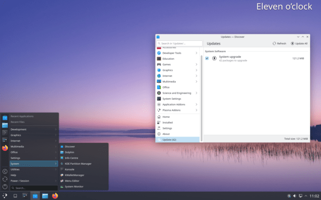
While some of the options in System Settings are a bit on the technical side, the layout is fairly easy to navigate and the categories are usually clear enough to make sure we are diving into the right collection of options. To make matters easier, there is a search bar where we can type words related to what we’re seeking. For example, I can type “display” to find settings related to desktop resolution and rotation.
All of these options bring me to what might be considered KDE Plasma’s main weak point: it’s complex. KDE does not have what some designers might call a “strong personality”. The desktop is, by design, highly configurable. Virtually every aspect can be adjusted, tweaked, and toggled. Which can be nice, if you want to fine tune your desktop experience to suit you in specific ways. However, the flip side of this coin is Plasma is set up to be a collection of interchangeable parts. It generally does not feel like the desktop has a particular vision or a unified style. The pieces all fit together and interconnect well and the functionality of Plasma is well coordinated, but the appearance feels like a collection of parts rather than a deliberate design. Sort of like how a toy car built out of Lego blocks is functional and flexible, but doesn’t have the smooth, streamlined look of a toy car.
KDE Connect and Network Shares
One of my favorite aspects of Plasma is how easy the desktop and its utilities make connecting with other resources and devices. The Dolphin file manager, for example, makes connecting to network shares a simple couple of clicks. The project ships with its own web browser, called Falkon (previously named QupZilla) which is fast and has an interface which is unusually simple to navigate. Perhaps the best inter-device feature KDE offers is an application called KDE Connect.
The KDE Connect application is used to link, or “pair,” any two devices on a local network. KDE Connect is available as part of the Plasma desktop and it is also available as a stand alone application for other GNU/Linux desktops, Plasma Mobile, Android, iOS, macOS, Windows, and SailishOS. When KDE Connect is installed on any of these platforms, it can set up a connection with any other device running the software on the same network. The two devices can then choose to share files, share their clipboards, adjust volume on the other device, and share notifications between the two devices. This means a photo taken on an Android phone can be instantly shared to a paired desktop machine; any notifications of incoming email can be sent from my laptop to my phone; when my phone rings it will automatically silence music playing on my workstation; when a text comes into my phone I can reply to it from my laptop without taking my hands off the keyboard.
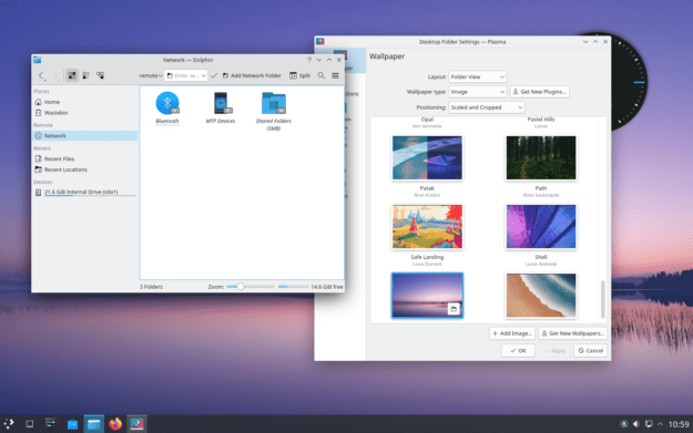
All of these features combine to make moving between my devices nearly seamless. I no longer need to think of certain actions as being things I need to do on my phone or with my workstation, the two have become extensions of each other, creating one merged environment.
Performance and Memory Footprint
In years gone by the KDE project had a well earned reputation for having one of the heaviest open source desktop environments. The project’s many features, applications, and options made KDE 3 and KDE 4 relatively heavy compared to their counterparts in the Linux landscape. However, around the time KDE Plasma 5 arrived on the scene, two things had happened. The KDE developers had trimmed down their desktop, making it lighter in memory and easier on the CPU. Meanwhile, several other desktops (particularly Gnome and its various forks) became heavier. Since Plasma was getting lighter while other desktops were growing, the KDE Plasma desktop now holds a comfortable middle ground in terms of resource usage, roughly on par with Xfce.
While running KDE Neon, my system consumed about 5.4GB of disk space and 620MB RAM. The CPU was largely idle. In contrast, I find running Cinnamon on Linux Mint requires around 650MB of RAM and Gnome on Ubuntu uses around 1,000MB of RAM.
Related Applications
As mentioned at the top of this overview, the KDE project provides not only the Plasma desktop, but also a full ecosystem of applications around the desktop. KDE offers a web browser, file manager, and control center. It also provides optional audio players, video editors, development tools, text editors, system monitors, drawing applications, and even an entire office suite called Calligra.
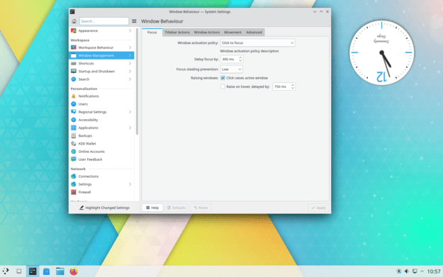
Browsing through the available applications we find messaging applications, news feed readers, games, a software center, log readers, a disc burner, remote desktop client, and BitTorrent client. The list goes on. In short, chances are most of your desktop functionality can be supplied by the KDE project. This is convenient, as KDE applications generally share a common look and feel and will work well with Plasma themes. This allows us a degree of consistency across applications we might not achieve if we were using a lighter desktop and pulling in applications which use different styles and development toolkits. Some Linux distributions, such as KaOS, go so far as to focus entirely on providing a good KDE Plasma experience with its family of desktop software.
Conclusions
KDE Plasma certainly isn’t the only popular Linux desktop environment available these days. The ecosystem is full of polished, rich, and useful options. However, virtually no other desktop environment has been around as long, offers a such a wide range of associated applications, and is as incredibly flexible as Plasma. The desktop, and its related projects, like Plasma Mobile, can run just about anywhere, run well even on limited hardware, and provide most desired functionality. With the added bonus of being able to connect to network shares and link devices using KDE Connect, this makes Plasma one of the most full featured open source desktops available today.

Jesse Smith is a Canadian computer enthusiast who enjoys sharing his love of all things software-related through the written word. When he’s not creating or talking about software, he entertains himself by running Dungeons & Dragons games, wandering by the ocean, and seeking the perfect batch of oatcakes. He writes weekly columns for DistroWatch.com in which he reviews open source operating systems and shares tips for using the Linux command line.


Nice intro to KDE Plasma.
I’ve been a KDE use since 1.0. Have tried several DEs and WMs since but couldn’t last more than a day there.
KDE widgets just feel lighter and snappier, admittedly because of Qt, and love how configurable it is.
Had Matter: I had a long love affair with KDE too. Although for the last ten years or so my default has been Xfce, sometime I still find myself missing KDE. I’ve never liked Gnome, not even back in the so-called good ol’ days, according to all those people who are now using something like Mate.
People accuse KDE of being “unstable” or “unpolished,” and while the latter may be true to some extent (and is being addressed), instability comes with taking risks. I can still have desktop icons, a system tray, panels everywhere around the screen and, the best part, an actual file manager that doesn’t just look pretty.
It’s easy to be “stable” when all of your work boils down to an unmovable black bar permanently taking vertical space off your screen, and a lifeless desktop that needs at least five extensions to be usable. I’d take KDE’s instability over a “designer desktop” any time. If it’s not working for you, report a bug, submit a patch. If I saw the same amount of bug reports/patches as I see complaints about KDE, it’d be the bee’s knees by now. And being able to directly improve the software you use is a feature in and on itself.
I like Linux a lot my problem is I run 3 different versions of Linux. Manjaro,Ubuntu,mint but no windows
I’ve used almost exclusively KDE and this post is spot on with the description of it’s workings,
Have used KDE for about 15 /20 years yeah through the heavy on resources era and all the way till now when it’s fast and so good it’s my Kustomized Desktop Environment and I love it . . .
Have tried the other desktops Xfce etc they just bother me with having admin permissions to do simple things that KDE does without any problems an
If you want really light DE turn most if not all the Desktop Effects on low end machines and that does make a difference without compromising function.
Thanks for the positive post.
Started with KDE2 and only strayed from it in the early days of KDE4. Once we figured out the whole indexing service thing it was like coming back home after experimenting with other options. I only use a few of the features available, but those are essential to me. My desktop still looks and acts the way it did in 1999.
I find KDE Plasma easily the best desktop environment there is on any OS. It has a lot of flexibility to make the desktop layout/look just the way I want it and also for it to behave just the way I want. There are a lot of features I quickly miss in other desktops, for example I miss activities a lot, the great integration with the KDE apps, the Vaults feature for encrypting folders, window manager is just awesome, and I like it how almost everything has a keyboard shortcut assignable so I can control it with keyboard. And all is just getting better and better, which is a complete opposite trend when compared to closed proprietary desktops that are just getting more dumb don with each release, and much more bloated and they even integrate more shitty features like spyware/surveillance and ads. So yeah, KDE Plasma is right now the best you can have on the computer.
I was switching it between Gnome and KDE periodically, and ultimately KDE has all the tools that I’d want to tailor my experience exactly to me.
It’s actually pretty nuts that you can create the Unity experience inside KDE and barely needing to venture outside of the built in “Get New…” tool (though you do need to get some of psifidotos’ stuff to get that experience smoother).
Kwin is super useful. Its built-in Kwin Script and now simple tiling experience is so neat. Kwin script parachute has the Overview even before that was official, same with Exquisite and custom tiling, and I use hide_titles all the time to get that Unity hidden titlebar when maximized. But most of all: kwin rules. It is so convenient to be able to start your PC and your apps and it’ll all be tailored exactly as you prefer them to be, without manual intervention.
There’s also krunner, dolphin file manager, and gwenview all of which are the best in their class of apps for my usecase. They all just become a web of very convenient powerful-when-needed yet simple-by-default tools that I’ve come to can’t stand not having. I have nothing against Gnome, but I realize that I became irate at it because I’m just not used to not having seamless access to the KDE tools I rely anymore, and that’s why I just KDE all the time now.
This blog article is hard to read. Because of the moving read banner on the top. Somehow, those moving text confuse me a lot. Sorry but likely skip this site.
@InnocentBystander
Because of the moving read banner on the top. Somehow, those moving text confuse me a lot. Sorry but likely skip this site.
Hello
One solution hover your mouse cursor over the moving banner that stops it and when needing to scroll down page do so then put mouse back over moving banner, why let one small thing let you miss out on some good reading 🙂
I can’t count the number of linux distros I have used over the years. I do know I keep coming back to KDE (KDE neon lately).
Takk! Danke schoene…