I’ve been kicking an idea around for a while now. I deemed it important enough to keep a notebook, a place where I could jot down my ideas and questions…maybe a profound revelation or two. I’ve collected ideas and thoughts concerning this topic from folks like Jim Zemlin, Dana Blankenhorn and Tom Adelstein. And while some conversations took place a while back, the input is no less valuable.
 I’ve spent a good deal of time, as well, kicking this around with my partner-in-ink Larry Cafiero. And some of the things I’ve taken away were not gotten face-to-face: Folks like Steven Vaughan-Nichols and Matt Hartley have discussed it through their preferred media in one way or another.
So what’s this big, important topic?
It boils down to to this: Are you hot…or not?
I’ve spent the last decade introducing people to Linux. These weren’t “here-this-is-a-live-Linux-CD-figure-it-out-yourself-and-good-luck” encounters. We’re talking face-to-face interactions, and often those interactions took place for more than an hour. Sometimes in two or three sessions. I’ve had a chance to see and hear people’s wide range of first reactions to Linux on the desktop, and there is no way to misinterpret those reactions:
Linux on the desktop will often float or sink just from the way it appears to the beholder in the first minute.
 So okay, many of you couldn’t care less if Linux on the desktop ever sees the light of day on a wide scale. It works for you and that’s pretty much all you care about. And that’s fine. I don’t have any reason, or really any right, to try to sway your opinion. But there are those of us who do care, who are legitimately looking for a way to get people to understand the rights and the choices they have when it comes to using a computer.
So what constitutes whether an operating system makes a good impression in the first minute of exposure?
It’s the bling baby…it’s the bling.
Of course there are LOB to take into consideration. That’s “levels of bling” for you playing along at home.
I realize that an older Pentium 4 with 1 gig of RAM isn’t gonna spin and shine, bringing out the wow factor right away, but there are most certainly ways to make it better than a dull wallpaper and dreary decorations from Windows 2000. And I will say this again…to many of you this won’t made a bit of difference. But to those of us who introduce Linux to people who have a real interest in using something other than the buggy, crash-prone Windows system? There are a number of things we can do straight out of the gate to get the new Linux user’s attention quickly and in a positive way.

| [yop_poll id=”45″] |
So what’s your bling factor? What kind of bling attracts you?
Leave me your thoughts below. Next week, we are going to to do some side by side comparisons. Comparisons between one Linux system and another. What catches the eye and what doesn’t. Or even worse, what gets scratched off the list immediately. I’m not out to hurt anyone’s feelings or downplay the work people put into their distros. So much of this is subjective…in the eye of the beholder and all that. We’re going to take a look and see what can be done to make that first 60 seconds a positive factor when new-to-Linux folks decide whether they care to explore this Linux thing or not.
We’ll take a look at the good, the bad and the, uh…not so attractive, and see what changes we can suggest to those who choose to listen. See you then…
We need you to help us make FOSS Force even better. If you enjoyed this article, please visit our IndieGoGo page and make a small contribution to our fundraising campaign. Every little bit helps.
Ken Starks is the founder of the Helios Project and Reglue, which for 20 years provided refurbished older computers running Linux to disadvantaged school kids, as well as providing digital help for senior citizens, in the Austin, Texas area. He was a columnist for FOSS Force from 2013-2016, and remains part of our family. Follow him on Twitter: @Reglue


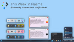
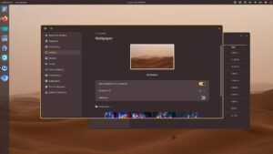
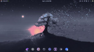
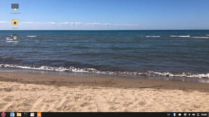
Personally I don’t like bling but I recognize its importance to others (sometimes). KDE is great for bling.
What I find is that if I set it up to approximate The Redmond Menace, people find it familiar. Sometimes I’ll throw up some fancy wallpaper.
My wife went from XP to Xubuntu without blinking or much instruction. Ymmv.
I thing Gnome is the best way to go, light enough to work on most machines and is slick, with simple effects and a pleasant visual theme and appearance.
Give me something that allows me to use keyboard shortcuts. I tried a lightweight desktop and was disappointed to find that I had to use my mouse to use the start menu. Sigh. Back to Gnome where I can’t alt-tab between windows of the same application anymore. Double sigh.
Of course Windows didn’t get the start menu right either. They forced us to have a Windows key (Big-L?) on our keyboards, but if we used it to bring up the start menu and the menu happened to fall under the mouse, suddenly the mouse was in control and the keyboard couldn’t do anything. Maybe that’s why Windows 8 lost the start menu.
And maybe some projects are just too large to get correct…
Given the results of your poll, and my experience in running desktop Linux since there was desktop Linux, it seems clear that KDE (now “Plasma”) is the slickest and best looking desktop environment out there. There’s just no contest. Note that I’m not talking about whether one desktop environment is a better working environment than another. I know we can all make cases for our DE of choice.
That said, it has always amazed me that the Linux and free software world, presumably looking toward Linux World Domination ™, chose to put so much energy into GNOME (now Unity) when clearly, KDE was the crown jewel when it came to “bling”.
Marcel Gagné
Writer and Free Thinker at Large
Note: This massagee wos nat speel or gramer-checkered.
You forgot elementaryOS (or whatever their desktop environment is called) in your list.
They are one of the few DE teams who have invested a lot of time in designing software that looks good, and (afaik) they are the only ones who have chosen to sacrifice lots of features in the process. So in that way, they are relevant to your debate: would you advise elementary to end-users who are happily using windows or OSX (ie end-users who won’t care about linux’s customization power)?
Amongst desktops which remain true to the “let’s allow users to customize what they want to” philosophy, though, yes KDE seems to be a clear win. But it is somewhat hard to sell on older hardware. It is possible to get a very beautiful desktop on old hardware using xfce.
I think there is a fork of E17 which is being developed as part of the Bodhi linux project. Moksha Desktop code is on Github, still WIP but E17 was the most beautiful light weight desktop I’ve used. It is highly customizable as well. It is also much lighter than KDE or Gnome… but if that is too slow then you can go with something really light like RazorQT and just load some funky conky scripts to give that extra bling factor.
Want to impress me? Here’s how. Use KDE as your default desktop, and have desktop effects disabled by default. Have some nice looking wallpaper or maybe a slideshow of several nice wallpapers. Have icons on the desktop or the status bar at the bottom of the screen for the most used programs. Include a trashcan widget on the desktop. Have an icon on the desktop that opens a brief tutorial on how to customize the most common things like changing wallpaper, desktop themes etc, or may plays a short video on the subject. In the default menu entries give a few words of description what each program does…new Linux users are often afraid to open a program if they don’t know what it is for or what it does. Oh, and one more thing…make sure that everything installed by default works properly.
– Best: GNOME / PANTHEON
– Worst: ENLIGHTENMENT / FLUXBOX
Outdated Icons in all DE’s
Bling. I love Unity. It is the Icons of my most used software down a narrow strip on the left hand side i like. But the down side is the hunting for that little used program that I just can’t remember the name of.
But XUbuntu is nice too. As far as the appearances go,I love the cool blue desktop with that mouse in the centre. The menu system is cool as well.
Then there is the current Anti-X desktop, I like it as well.
The Bling is in the choices we have.
Personally the best way for me to describe the bling I like is stylized classic windows.
If I ever ran by a linux destro that straight out of the box looked and felt like windows 2000 but slightly nicer (better shadows…etc) with modern features it would be my dream OS.
I agree with John Kerr. The unity icons down the left side and your favourite wallpaper are the most efficient bling. I’ve tried lots of distros and there is always some problem for me including ubuntu derivatives, official or unofficial on my Lenovo Q190. The best and fastest for me is Ubuntu Unity with Linux kernel 4.0. Perfection would be unity with the ability to search a program’s description.
Unity makes me stabby.
In my limited time as an “introducer of Linux to Windows-bound people”, I stuck Mint 16 XFCE on a box my father-in-law and I scavanged together out of several computers (he’s a packrat) to use as a quick-and-dirty media center and he took right to it. I only did some bare setup.
I put the same thing on an aging laptop as an option alongside Windows 7 that I had to rescue for him and my mother-in-law (the old HDD had bad sectors in a very bad place). She’s the primary user. She seems frightened of it.
Two completely different reactions from the same thing.
Bling isn’t important to me. I just need my machine to do what I want, when I want it.
XFCE and LXDE are good. KDE is too bulky, and Gnome/Unity are unusable.
Maybe you could put a prize in every bag? Cracker Jack Linux
Happy Meal Linux. Toasters worked well for banks, they do have
all the money now.
Look at the cars/trucks being made (mostly made) in the US, yep
Bling mobiles that don’t seem to be selling well.
Or maybe if we all called it GNU/Linux……
Folks always talk about how “customizable” Linux is. If that is
true then just #apt-get install bling.
Make Linux work, no dependencies missing, printing and wifi are
not perfect yet. If our new believers don’t have to swim upstream
quite so much this is going to work.
Ken,
Beautiful wallpapers and screensavers are my Linux bling.
I have used Linux (Ubuntu 6.06/8.04/10.04, Debian and Linux Mint 11/13/17) for 8 years, and prefer LM’s bling as IMNSHO it has the most attractive wallpapers/screensavers. I otherwise don’t care much about the way it looks, as long as I can neatly slot the icons for my favourite programs in the top & bottom panels. Have used Gnome 2 and Mate with LM due to laziness in not wanting to learn a new desktop environment :).
One major thorn in my side is the problems I’ve had with installing Ubuntu/Debian/LM – I do clean installs when upgrading versions and have only ever had 1 that worked without any errors.
Printing has been a lesser problem (only use HP) but once I realized I was better off with HP’s own drivers and not Ubuntu’s/Debian’s/LM’s I have had relatively problem-free printing.
For me, it’s not necessarily the “bling factor”. I like all the bells and whistles available in KDE which assist my workflow, save me time, mouse clicks, and keyboard input.
If it happens to looks good at the same time, great. But a static bacground would be OK also.
Whenever I try Gnome or Unity I have to shout at it to make myself heard. They both want to do their own thing. I have to just tag along.
With XFCE I am in control. I like a line of small icons on the top, drop down menu, near black text on light grey menus. I want: No big blobs of black or purple arhg! No fugitive menus that disappear on their own whim. No windows that suddenly fill the screen because I got too close to the edge.
That is what will draw me to a distro, but I do recognize that I may not be specifying bling here. Maybe, for folk like me, bling is not so desirable. Just make it so that at a keystroke I can piss off the corny cube and the spew purple.
Well, I certainly know what you mean when you say that the first impression someone has of the OS are important. I have seen a geek (who you would think should know better than to trust a first impression about a desktop) be turned off when he saw me using a very plain IceWM desktop.
I don’t have a lot of experience showing people heavier desktops (like KDE or Gnome) because I don’t use them much. However, different desktop arrangements I have shown people have made different impressions.
To me the default Salix Fluxbox 14.1 desktop looks great on an old IBM Thinkpad I have from early 2003 because it makes the machine usable (and the default theme is a pretty good one). That setup, however, is not one I would show someone to put them at ease about using Linux.
I already mentioned that just running ‘apt-get install icewm’ on a *buntu or Debian distribution and running the resulting window manager will turn off most people when they see your desktop. However, IceWM is also a lot more flexible in appearance that people sometimes realize. You can theme it much more attractively and use Compton for compositing and make it look pretty good. Just the same, it’s not something I would be likely to give someone else (perhaps someone on a very old machine) because changing things on the desktop is not done in a very familiar manner.
Enlightenment on Bodhi doesn’t turn people off because of its austereness like IceWM or Fluxbox might (people seem to see austere and think it means old). However, they do seem a bit intimidated by it. I think it looks a little too different from what they are used to. Also, Enlightenment is quite customizable, but something about it seems less than straightforward to me.
Actually, Xubuntu seems to make the best impression of the systems I use regularly. You have to disable the built in compositing in Xfce and use Compton instead to avoid tearing when scrolling or playing video. People seem comfortable with it right away, and they like the way it looks even with the default theme. Debian with Xfce is not bad either, but a nice wallpaper helps out.
Other than that, I’ve noticed that screensavers attract other people’s attention on machines that have them enabled. There are a number of screensavers for X-Window that people seem to find fascinating.
For looks, as long as compositing is enabled, fonts are anti-aliased, and gradient colors exist in the theme, it seems like a familiar feel is more important than anything else.
The bling factor MATTERS. I gotta agree with many that say all they want is for Linux to work. Yet I’d like to expand that and say I want Linux to “just” work, but for it to do so beautifully.
That way we can trump BOTH OSes (Windoze & Mac). I just built a new desktop for me, and installed from scratch both Windows 8.1 and Linux Mint 17 (Rebecca). I mostly use Windoze for games and the occasional compatibility-restricted work-related thing (my workplace is a full Windows 7 shop), and in Mint I do pretty much ALL of my personal computer-related activities (email, browsing, documents, programming, etc).
There is NO comparison: Mint’s installation is fast and seamless, whereas Windows 8.1 with its several restarts is a royal PITA. And, IHMO, with the right theme Mint looks MUCH better now than Win 8.1. Also, on the functionality side, there were no snitches.
So One down, one to go. Now all we need to do is make Linux so gorgeous even the Mac fanbois cannot resist it… 8)
My favorite linux desktop UI ever was the heavily-customized Enlightenment that shipped with the original Ubuntu Netbook Remix (http://www.pendrivelinux.com/wp-content/uploads/Ubuntu-NetBook-10.04.jpg). It was simple, to the point, and put everything where it was about two clicks away from reach. It was especially useful on the tiny screen of my EEEPC, but I think it would have made a brilliant touchscreen interface. My biggest complaint about it was that other than being able to “favorite” shortcuts, you couldn’t really customize it easily.
For my daily desktop duties, I’m a big fan of Gnome 3 Shell. I know that doesn’t make me very many friends, but I’ve gotten to really like it.
dwm + some pop-up or in-window transparent launcher with icons = op bling with an edge :p
@Fred
True, but alt-tilde will switch between windows of the same application.
XFCE + Kwin + nice wallpapers + icon and colors
xfce lets you display different wallpapers on each desktop
xfce you can make a launcher or better yet, use cairo-dock
and a pie menu from gnome
I use Lubuntu, with a side helping of some KDE as my DE. That allows me to keep the basic look somewhat XP’ish, and yet give me the full Linux appeal. I keep the task-bar at the top in true Gnome fashion as well, partly because I use dual screens. The KDE allows me to add stuff like Knemo to the LXpanel and some other non-native widgets that I need. Also the Openbox WM is very configurable, and can be made to go from basic to very comfortable via the right-click menu, which you can easily customize with Geany. [ sudo geany /usr/share/lubuntu/openbox/menu.xml ]. Add some decent desktop wallpapers and voila … its yours. Also printing is a breeze to set up, with foo**/cups or as Dorothy pointed out with HPLIP for HP printers. I started out as a RH fan years ago and made the switch to Deb-based about 5 yrs back,and have never regretted it. I think the
best true method of making people see-the-light, is to put the open source apps on their windows box’s and get them to use them only and then get them to do a project on a full linux box. And then ask them are they ready to dive-in to a life of freedom and satisfaction. Linux on the desktop ….. look out windows, it runs everyones Smart-phone devices, and the desktop is soon to be added to that list