Gina Dobrescu and Jim Hall
“Thou shalt make thy program’s purpose and structure clear … for thy creativity is better used in solving problems than in creating beautiful new impediments to understanding.”
~ “The Ten Commandments for C Programmers” by Henry Spencer
How easily can you use your computer? Today, the graphical desktop is our primary way of doing things on our computers; we start there to run web browsers, music programs, video players, and even a command line terminal. If the desktop is too difficult to use, if it takes too many steps to do something, or if the cool functionality of the desktop is hidden so you can’t figure out how to use it, then the computer isn’t very useful to you. So it’s very important for the desktop to get it right. The desktop needs to be very easy for everyone to use.
Whenever we think of how easily you can use a program, we’re really talking about the usability of that program. Developers sometimes discount usability and think of usability as making things look nice instead of adding new, useful features. Other times, developers assume usability is too difficult, something that only experts can do. But usability is a very important part of software development.
![]() Usability is even more important in open source software, because users often experiment with the software with no one to guide them. In such cases, the software must be intuitive and functionality must be obvious. If the software is not easy to use, if the features are not immediately accessible by a few clicks, then new users will be turned off. Open source software must have good usability if we want others to use it, and if we want more people to prefer open source software over proprietary software.
Usability is even more important in open source software, because users often experiment with the software with no one to guide them. In such cases, the software must be intuitive and functionality must be obvious. If the software is not easy to use, if the features are not immediately accessible by a few clicks, then new users will be turned off. Open source software must have good usability if we want others to use it, and if we want more people to prefer open source software over proprietary software.
How to test usability?
Developers can use any number of methods to examine the usability of their software. From simple surveys to full usability tests, developers should simply use any method that highlights trouble spots and confusing user interfaces in the software. But it is hard to top a formal usability test: watching real people use the software, and noting what they do and where they seem confused. Developers can learn a lot about the usability of their programs just by watching a few people using the software, and making note about what they do and how they try to use it.
A formal usability test is very straightforward and doesn’t take much time. The overview is only three simple steps:
- Who are your users?
Start by considering what types of people use your program. Is your program intended for general users with average knowledge? Or is your program going to be used by experts who need advanced functionality? You might write down descriptions of the people who might use your program.
- Why are people using your program?
Use the descriptions of your users to better understand not only who is your intended audience, but what they will use your program for. If your program is a music player, will your users want to simply play music files on their computer, or will they also want to listen to streaming radio stations? Will they want to rip music from CDs to listen to later?
- What do you want to test?
Once you have a general idea why people will want to use your program, then build a test around that. A usability test is a series of small tasks that you ask people to do. These tasks usually provide a brief context to set up a situation, then ask the tester to do something specific.
Find a few volunteers for your usability test. Most usability tests generate useful results after about five or six testers, so you don’t need many volunteers to help you. Set aside some time for them to do each task, one at a time, and watch how they use the software. What buttons and icons do they click on? What menus do they access? Observing testers in this type of usability test will quickly inform you about problem areas in the user interface, where users are likely to become confused in how to use the software. You can then improve these areas, and make the software even better.
Usability in GNOME
During a Summer 2015 internship with Outreachy, an organization that helps underrepresented groups get involved in free and open source software, we conducted a usability test of the GNOME desktop. This was a formal usability test, where we invited a dozen testers to use GNOME and GNOME applications to complete a few simple tasks.
Test volunteers were about evenly divided between men and women (slightly more men than women) predominantly at college age (12 to 25) representing all levels of computer skill but describing mostly “constant” computer use. About half of testers had not used GNOME previously (slightly more had not than had).
Participants were free to choose the language version of GNOME. Five of them chose to test GNOME in French, while the other seven used GNOME in English. The choice of language did not appear to influence the results of the usability test.

In our test, we presented each tester a set of sample tasks, one task at a time. Throughout the test, we watched each volunteer as they completed the sample tasks, and noted any problems they had with the software. We asked the testers to speak aloud during the usability test, to describe what they were looking for; if they were looking for the “Print” button, they should say, “I’m looking for the ‘Print’ button.” After each set of tasks, we took a “comment break” so participants could share their thoughts about the software and the problems they encountered.
The total test duration varied, with the shortest test at thirty minutes and the longest at an hour and a half.
To provide an overview of the usability test results, we used a heat map: a grid that indicates how easy or difficult it was for the participants to accomplish a task. Each column represents a different tester, and each row represents a specific task each tester was asked to perform. Each colored cell in the heat map represents the relative ease (or not) for the tester to use the software to accomplish a task:
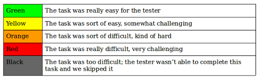
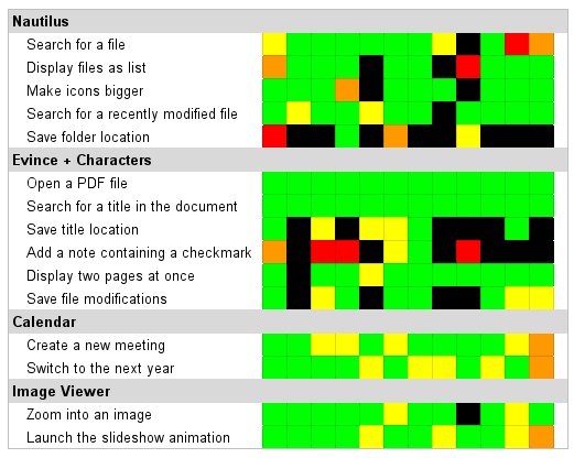
The heat map method presents a holistic view to the usability test. Note the “hot” rows that contain significant black, red, and orange:
Nautilus
** If our coverage matters to you, please consider supporting our work through our FOSS Force Independence 2026 fundraiser. ** Save a folder location (bookmark)
Evince + Characters
Save title location
Add a note containing a special symbol
Save file modifications
Other rows are mostly green with some red and orange, suggesting these are areas that require some improvement in usability:
Nautilus
Search for a file
Display files as listEvince + Characters
Save file modifications
Rows that have mostly green with only a little yellow represent tasks that have good usability. These seem to perform well for testers, so do not need attention.
What went well
Participants quickly became familiar with Calendar’s interface, so they all managed to accomplish the two tasks, althoug users who encountered little difficulty during these tasks were a little bothered by some aspects of the interface.
Testers also had an easy time during the Image Viewer tasks, and encountered little difficulty accomplishing them. Unlike experienced users, GNOME beginners discovered another way to zoom into an image, by entering into the full screen mode and using the “+” and “-” top buttons in order to adjust an image.
Almost half of the participants on this usability test had never used GNOME before, but it was very interesting to observe them during the test as I discerned a common behavior pattern . For example, when they discovered the three line menu (sometimes called a “hamburger menu”) in Nautilus, they understood that they could select many options from there. Or when they wanted to launch the slideshow animation in Image Viewer, their instinct was to go directly to this menu.
In the Nautilus file manager, testers used different methods when asked to search for a file. Some clicked on the magnifying glass and then introduced the name of the file, others used the ctrl-f keyboard shortcut, and a few chose to manually click into each folder to locate the files. Regardless of the method, all testers managed to find files quickly using Nautilus.
Testers also found the Calendar application very easy to use. In the comment breaks, testers reported the program responded the way they expected. For example, they could easily create new meetings with specific start times and attendees.
Where GNOME can improve
Testers struggled through several sections of the usability test. We can learn much from observing the testers as they encountered difficulty in hidden behavior or inconsistent feedback. These provide opportunities for GNOME to improve its usability. The usability issues can be grouped into four general themes:
- Functionality should be obvious.
In Nautilus, most of the testers did not manage to accomplish the fifth task (bookmark the location of a folder). One of the GNOME beginners did it by accident (drag and drop) and said he would never have thought about this method of adding a bookmark. Almost all the users expected the sidebar area to be more explicit and people expressed a desire to see titles for each category of folders (personal, network, bookmarks, etc) in this area.

People who had never used GNOME before found the Nautilus “magnifying glass” button confusing and did not think of using it when searching for a file. These testers only discovered its functionality later. For most of them, the “magnifying glass” symbol represented the zoom functionality. Also, when they were told to make the icons bigger, these testers got a little confused about the option “order by size” from the menu button.
In Evince, the only way to get to Annotations is by displaying the sidebar panel on the left side of the window, and then selecting the right option from the dropdown menu. But sometimes participants closed the sidebar panel by mistake and did not know how to get to it again, which is when most of them gave up this task. Even when they discovered this option, some of the participants could not understand how it worked, as there was no indication on how to use it.
In the Characters application, testers found it difficult to locate a specific symbol. When asked to use the check mark symbol from the “Dingbats” font in the new Characters application, some of the testers used the magnifying glass in order to search for the name of the font. They got a little confused because the search bar’s purpose is not mentioned anywhere. So after they discovered that the fonts were in the hamburger menu, they found the right symbol by browsing through all the available categories.
In general, participants encountered most of the problems in the “menus” area from the header bar (hamburger menu, magnifying glass), as they were not explicit enough for them. We want to highlight this problem, because when testers did not know what a button or other functionality meant, almost all expected a hint when they put their cursor over it, especially those testers who had never used GNOME before.
- Features need to act consistently to each other.
Bookmarks caused problems in Evince, and half of the users failed to accomplish this task. In Evince, there are two ways to add a bookmark: by using the option from the hamburger menu, or the one in the sidebar pane. Experienced users who used the option from the hamburger menu also discovered the one in the sidebar panel. These testers complained about the lack of “consistency” between these two methods, as they do not function the same way. For example, a bookmark cannot be deleted from the hamburger menu, whereas it can be deleted from the side pane.
And in the Calendar application, changing the month/year of the current view caused confusion for some testers. In order to change the current month, they had to use the arrows on both sides of the “Today” button. In general, people expected these buttons to change the current day.
- Activity should provide clear feedback.
In the Nautilus file manager, many testers had problems displaying files as a list. Most of the participants tried to right-click within Nautilus, or attempted to use the hamburger menu from the top-right corner of the window. A few testers discovered the Preferences menu option from the application menu, where they could modify the “Default View” parameters to a “List View” from a dropdown menu. Every participant who chose this method complained that there was no “Ok” or “Apply” button and they waited for immediate feedback (which did not happen in this case). This made them feel confused and they made comments like “Why nothing is happening?” or “This is not working.”
In order to make the icons bigger in Nautilus, testers either used the Preferences menu item (but there was no visible effect) or tried to use the slider from the top-right menu. For those who chose this method, many started to drag-and-drop the slider, but were disconcerted by the lack of “visual feedback” as they moved the cursor to the left or right. Moreover, the absence of symbols like + or – to explain the function of the slider made some of them give up.
Testers were similarly confused when trying to save the location of a folder for later use in Nautilus. You may recognize this feature as a “bookmark.” A few testers tried to drag the folder into the upper part of the left sidebar, but only managed to move the folder into another folder such as Home, Documents, or Downloads. Some accidentally dragged the folder into the Bookmarks section, which is correct, but did not realize that the action was successful.
Some testers used the hamburger menu to bookmark a folder in Nautilus, but they were not sure what happened. While their attention was in the top-right corner of the window, they did not observe what happened on the left sidebar to create the bookmark.
In the Characters app, most of the people who had never used GNOME before got lost when they had to copy the check mark special character. Testers did not understand what happened when they clicked on “Copy Character” (or if the button really worked). They complained that there was no visual feedback when clicking on this button. We think this happened because the testers were not used to this type of application, no matter the system they usually use.
- Make wise use of menus.
In Evince, testers were confused when adding a note in a PDF document. Only one participant successfully completed this task, as he uses this feature at his work. After exploring the top-right corner menus, all testers hoped (again) to find a solution by trying to right click on the document. Participants seemed really lost when trying to solve this task. At a given moment, some of the testers tried almost everything, and they eventually discovered the “Annotation” feature in the dropdown menu from the sidebar panel.
Testers also struggled when they had to bookmark a specific page in Evince. Most of them missed the “add a bookmark” option from the hamburger menu, as the list of options from this menu starts with words related to file manipulation (save a copy, open a file, etc.). So whenever they opened this menu, they did not want to read all the items of this list. Most of the time, they made comments like “It’s not here, I have to look somewhere else” or “This should be obvious, I would like to know how to do it.” Most of the users who discovered this option and selected “Add a bookmark” from the list, were complaining about the fact that there was no visual effect, so they were not sure if the page was really saved somewhere.
Learning from GNOME
In open source software, developers often place highest priority on creating new features and adding new functionality. But the most feature-rich open source software program is useless if its interface is so difficult to use that no one can access the critical functions. To make their programs easier to use, open source developers must also consider the usability of the programs.
Unfortunately, the concept of usability testing sometimes runs counter the the open source software ethos, where most developers start by solving a problem that is interesting to them and then release it for others to use. But usability testing is not difficult to do. Anyone can do it. All you need is a little time and patience; watching a few testers use your software will help uncover areas that are difficult to use, so you can improve the interface and make it something that everyone will want to use.
In the absence of a formal usability test, you can take a shortcut to good usability by learning from usability testing in other programs: where those programs fare well, and where those programs need improvement. In my usability tests in GNOME, I find open source developers can get quick wins by observing these simple guidelines to user interfaces:
- Functionality should be obvious.
- Features need to act consistently to each other.
- Activity should provide clear feedback.
- Make wise use of menus.
These usability themes will make most open source programs easier to use. They provide general rules to good usability. And with good usability, everyone wins.
 Gina Dobrescu is a student who is passionate about computer science and open source technologies. She completed an internship in usability testing with GNOME Outreachy in Summer 2015. |
 Jim Hall, an advocate for free and open source software, and open source software usability, is the CIO for Ramsey County, Minn. He has a master’s degree from the University of Minnesota in scientific and technical communication; his master’s capstone was an examination of the usability of open source software. |


While I used to be a Gnome user, I now find it unusable. I use Mate now, and would switch to Unity before Gnome.
While I appreciate Gnome’s dedication to usability, I would greatly appreciate it if the usability concerns of people who are not confuse by what “order by size” means after increasing the size of the icons, would also be taken into account.
I’m all for making Linux easier to use for everyone, as long as, you know, “for everyone” is actually taken seriously, rather than just slapped because it sounds so freedomly.
The problem with “usability” is that it differs depending on who you are aiming for.
Gnome has improved usability for novices, at the cost of becoming an impediment to experienced and expert users.
I’ll use pretty much any other desktop before Gnome.
This will sound bitter, but as a Linux user of 15 years now, I can honestly say that I have been rarely angrier at the direction a UI has taken. It has become utterly unusable for me – a constant source of annoyance. I gave it up completely and will use *any* other environment first.
It reminds me of the Tiles in Microsoft environments.
A big player in its field gets a bad idea, introduces by its sheer size a supposed Standard, which results in costing me time and, like a nightmare keeps creeping into my day even if I try hard to avoid it.
Very nice article. Linux in general needs more of this formal usability testing structured around completing common tasks, not just for Gnome.
I have been using evince for a long time and did not know that you could insert annotations, I also went through the menus and right clicked and could not find it, often I close the side panel and I have never explored the side panel menu, now I know how to do it, only because I read this article.
The article is spot-on and a valuable pointer for developers.
Unfortunately FOSS developers (especially developers for Linux) tend to be programmers who are … interested in programming for its own sake. As we all know, this makes them relatively ill-informed on, and relatively uninterested in, GUI design knowledge. Until recently they also took the view that end-users needed to be educated in command-line knowledge, and that it was OK to simply offer command-line applications.
Over the years this type of developer has sort of faded from the apps-development scene.
Those that remain sort of acknowledge the importance of a GUI, but approach it from the wrong perspective. I.e. their own. They’ll spend a lot of thought on class hierarchies, perhaps even on programming details to do with GUI’s.
Nothing could be less relevant, as the article points out. If you want users to actually use your application, you must make sure it does what they want (not what you want). And how do you know? Well, this article tells you how to get started on that.
Gnome went from a decent desktop environment to a pile of trash. Essentially, the message that it sends is that it is the star of the show and that you will be allowed to do only what it thinks that you should be doing, and how you must be do it. If this (and Unity and KDE, to a lesser extent) is the Linux flagship in the desktop, it is not surprising that Linux in the desktop is a non-entity. And it will remain so indefinitely.
This should be re-titled to ‘A Usability Study of some common software used with the GNOME desktop’.
None of these tests tested Gnome usability, instead they tested usability of evince, nautilus, etc.
Anybody who is serious about releasing a desktop out into the big, wide world should do this type of testing. They should never depend on their own “instincts” – which are not instincts at all, but rather a set of learned behaviors.
If they don’t user-test, they ought to put a big disclaimer such as “not user tested” in a prominent location.
This is an excellent illustration of why I recommend something like XFCE, LXDE, or Cinnamon instead (my personal favorite is XFCE). GNOME lost me a LONG time ago as soon as saw in advance what they were fixin’ to do with version 3, and I haven’t touched it at all since.
I love GNOME 3.18 , I did not like GNOME 2.14 neither do I like KDE.
I actually tried Ubuntu with gnome and more recently Linux Mint with cinnamon. Both were rather frustrating to use when compared to KDE.
It would of been nice if Gnome 3 proper had been evaluated by the above process. Gnome 3 was eye opening for me coming from Gnome 2. It made me appreciate Fluxbox and the command line. I mean knowing how to get things done in Gnome 2 didn’t translate to Gnome 3 well. There is something to be said for a simple GUI that doesn’t change much over time. You learn how to do something and it won’t be obsolete in a couple years when the developers get a chance to try out new cool ideas.
My requirement for a desktop is that I can put whatever sort of object I want on it. My work is document centric rather than app centric so the main use for my desktop is to house a variety of WIP files or folders of files (applications’ most recently used lists don’t cut it).
There seems to be a fad amongst User Experience* Designers for not putting stuff on the desktop. Making it /possible/ to put things on the desktop doesn’t mean that you /have/ to; if the possibility is there hipster UX designers can continue to leave their desktops empty and real users like myself can continue to do productive stuff.
Last time I looked at Gnome3 the user wasn’t allowed to put anything there. Has this changed? If not it fails to meet requirements and I’ll stick to KDE.
If a program fails to meet user requirements testing its usability against tester-selected tasks as opposed to user-selected tasks becomes misleading as it cannot correct erroneous design assumptions.
*”Experience” in any blurb is usually a warning sign.
Gnome 3 always frustrates me. Often I cannot find items I want. Sometimes a useful feature is missing or deliberately removed. There seems no logical pattern to it, except perhaps cute code. My test installations of Gnome 3 have never lasted more than 8 hours. The comments above mostly express the reasons for my frustration.
While I can sympathize with a lot of what people have said about Gnome 3 I happen to love using it. It’s clean design and clutter free desktop suit me perfectly. And I think that’s one of the strongest points of open source as opposed to proprietary software, at least you have the OPTION to switch your desktop to what works for you, as opposed to other companies who dictate to you what THEY think YOUR desktop SHOULD be! (Microsoft 8 and beyond and their tiles and then Windows 10 trying to follow suit until “The Great Revolt of 2014”) I think all the developers should at least be given credit for TRYING to appease some folks, the only option you have when it comes to closed-source OS’es and apps? is to complain and hope they change things with the next release. Thank goodness for Linux and the devs who make the various desktops!
Cheers!
> ” It’s clean design and clutter free desktop”
To me it would be “poor design and useless desktop”. To take a paradigm that a lot of people clearly like, i.e. putting things on their desktop, and making it inaccessible to anyone who doesn’t want to dig through and edit config files, is asinine.
Yes, developers can do whatever they like with their software and thankfully we do have alternatives, but to design a UI in such a way as to force users into a particular mode of use because of developer preference is beyond incompetent. It’s like designing a text editor without copy/paste because the developer wants fewer menus.
To me Gnome fails the initial smell test and does not merit further use. Not surprisingly, systemd falls into this very same category of developer hubris since a lot of the same developers work on both projects.
Software should never be prescriptive in its usage – Countless users are far more imaginative than handfuls of developers, and will always find ways to use the software the developer never dreamed of. To restrict that is ALWAYS a mistake. I say this as a developer and a user.